Friday 25 December 2015

Type setting

In order to practise type setting skills the Mouse's Tale had to be represented in a modernist and a post-modernist way.

I found easier to come up with a modernist approach. Using the same font size, tracking and leading and try to match as accurately as possible the words with the photograph of a mouse profile.


Modernist Outcome


Following a same approach, and inspired on this image, I tried to build a mouse face using text. It was not possible because I needed more text to fill the empty spaces (and I eventually had to use the image to make the mouse stand out), but it was an interesting exercise as I wouldn't have been able to know what is necessary for this kind of design. Also, a previous vectorisation of the background would have been helpful to identify more clearly where the colours and shapes where necessary, like it can be seen in this example.
Post-modernist outcome

Monday 21 December 2015

Public Information Video/Research

After having watched every video of the 29 listed of the UK government's Central Office of information I decided to analyse "Smoker of the future". To do so I will analyse the message, key facts, tone of voice and audience.

A horrendous human without any kind of limitations or discipline reflects the result of ignoring bad habits. The message itself is to stop smoking or it would even affect the way humans evolve based on biological adaptations. The message of this video is delivered through a window that allows the audience to see a dystopian future: where the humanity is heading to if smoking becomes something intrinsecal to the human being.

One of the key facts is that the man is lying on a comfortable chair, in a future where machines do everything for humans. Humanity has become useless, and ugly. This ugliness is firstly spotted when the silhouette shows a huge nose, letting know the audience that something wrong is happening. 

With the intensity of a dark melody, the images create expectation. Also the expression of the actor is arrogant, which matches with the general idea of the stubborn smoker. The narrator presents it as something creepy and kind of scary. A person one wouldn't want to look like. But at the end, there is a bit of sarcasm after mentioning all the positive aspects of this futuristic person capable of smoking without getting any disease. This is when the narrator says: "Unfortunately, the first natural born smoker has never been born". This has to main ways to be interpreted: by smokers or non-smokers. Non-smokers would be simply scared and disgusted by the image of that person. Smokers would see their wishes of avoiding diseases and uncomfortable facts of smoking become reality, but not in the way they expected, scaring them from smoking.

The audience of this advert is probably young, between 18 and 30, as science fiction in 1985, the date of this advert, had quite strong influence on the young population. Also, older people normally were religious, so they wouldn't believe in such thing as evolution. That was something more contemporary and showing images of it had more impact to those who believed in evolution.

Wednesday 16 December 2015

Objective posts

One of the reasons I could not reach the 1st class grade in the first module was because I was not as objective as I was expected to be. In order to improve this important skill, we the students have been recommended to rewrite one of our texts and make it objective. So then, I am going to rewrite the production slide of the Studio Brief 1 of OUGD403.

The first drafts of the design started being left-aligned, so the letters G and W were aligned, as most of the customers refers to 'Games Workshop' as GW. There was a problem with balance, so the shape was taken back from the original logo with the text centered, being also easier to recognise for customers. A tight kerning was used in this new approach, with enough space between letters to be also readable in smaller scales. Un-kerned text resulted in a massive space occupied by the word 'Workshop'. The letter 'R' had to be modified to keep the 'K' closer and avoid an unnecessary gap. The leg of the 'R' was also taen closer to the stem as an alternative solution to this problem, but it looked unstable.

Different colour palletes were tried, such as reds and yellows, to keep it similar to the logotype. But these colours were away from a metallic three dimensional logotype, and it made it look plastic, just like the original logo. On the other hand, golden colours represented power and impact that matched with the bevel and emboss, resulting in a golden metallic three-dimensional letters.

The whole process was remade in higher quality so the bevel and emboss effect could stand out more as well as the added symbols. The colour used for the letters was #978253 and the bevel and emboss effect was applied with hard chisel, very sharpen. The Age of Sigmar symbols was simplified for a simpler message.

The ligting was replicated from the original logo. The light comes from the top-left, projecting shadow on the bottom-right.

Monday 7 December 2015

Wayfinding - Production + Feedback

Before jumping onto the computer I had to make a list of the courses and assign a colour to them. I used the colours provided in the PDF of Leeds College of Art identity guidance: Fashion (P.3385), Graphic Design (P.Yellow), Fine Art (P. 7419), Photography (P. 3135), Creative Advertisement (P.254), Illustration (P.1505), Visual Communication (P.5205). Having only 15 colours to pick from, I picked the ones that can create more contrast with the surfaces in the building for the courses, as, despite the building is used by student and workers, the main target audience are students.

At the beginning P 213 (Pink) was going to be for Graphic Design, but a design decision that will be explained later on made me change it for P. Yellow. P213 was the one used for signage using a mosaic, since it is the colour used for the mosaic on the website, which is the main colour for the logotype.


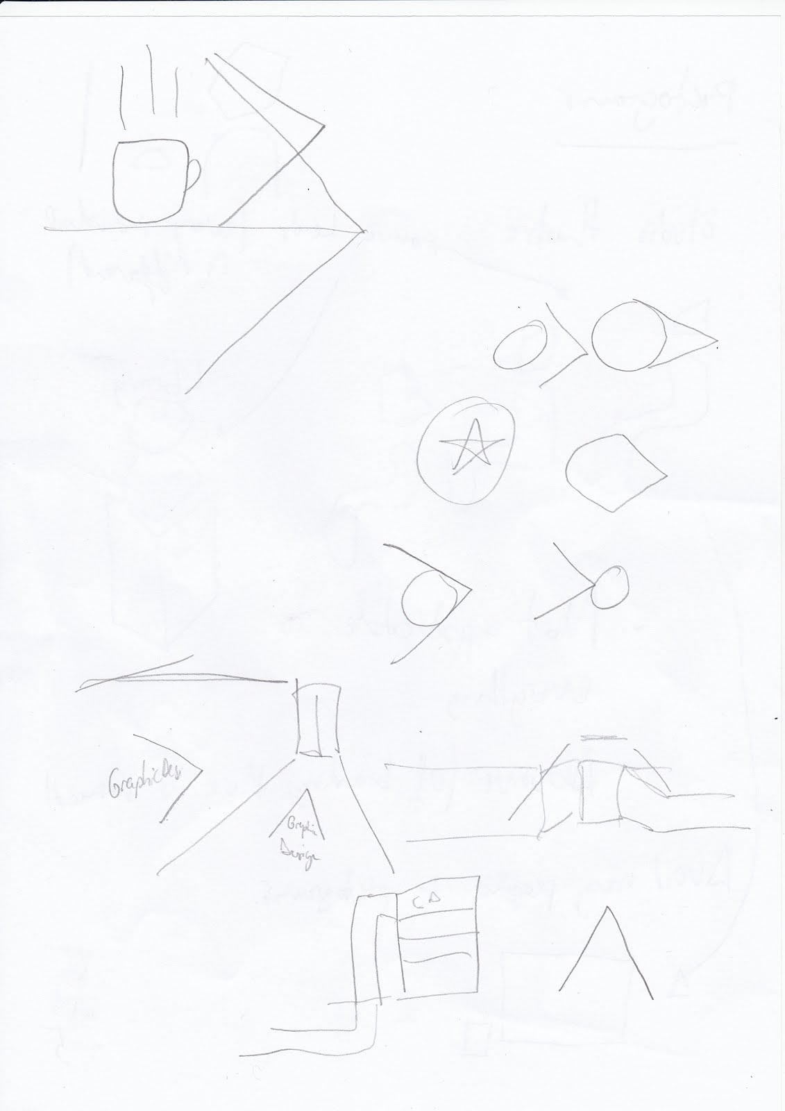
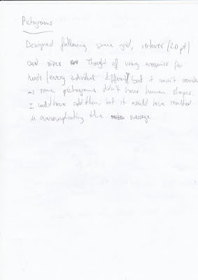
After having a chat with Simon about the work I've done so far, I was wondering how I could represent something like Graphic Design with a pictogram. He told that if I cannot think in a way of doing it, it's probably because there is no way. And if I design something for that, it won't be recognisable. At this point I decided not to use pictograms for courses, but just colours. Pictograms would be just for amenities and facilities.

During the process of designing them, I considered using persons with mosaics as heads to make the audience associate the users of the building as unique individuals. It was not only over complicating the message, but also some pictograms became difficult to understand. Therefore, not using persons for pictograms was the most efficient conclusion.


I designed the toilet pictogram trying to stay far from the usual design to avoid unnecessary sexist connotations. Instead, I made man and woman exactly the same, but the woman has rounded shoulders, as round shapes are related to women while straigh ones are to men. Although, it's interesting to highlight that I had to leave the man first, because putting him in the middle could create confusion, as it always come first.


At this point in time, some mock ups were made to check how the process was coming up.

The idea of following the pictograms i not very effective in the real world. Too much space is needed, it wouldn't be efficient in terms of printing or modifications and it isn't very sophisticated either. They looked too weak and forceless. Using the celing wasn't an option either, as there are many different types. As well as the floor, which is sometimes rug and sometimes concrete.


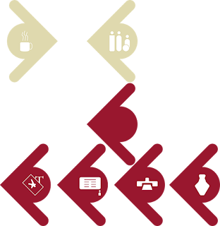
The arrows were visible enough and they have a clean aspect. Pictograms were visible in circles. After experimenting with different arrows this was the most effective outcome, as it saved space placing the circle in the space created by the two strokes.

The addition of the man/woman shape occupying the majority of the door is to easy identify where the toilets are, as many doors in the building are grey and toilets are usually hidden behind pillars.


After tossing the mosaics idea I realised that I had to rely more on the arrows. To do this, I made them thicker, so with the circle inside it would look like one single piece.

Using lights of a particular colour to designate the area of a course (which have an assigned colour) was not only effective because that colour covers everything around that particular place, making it easy to understand, but also made the experience of following signage interesting. Lights can add certain moods and aura to an area, and this aura can have a meaning related to a course.

More experimentation with arrows and a list of all the installations in the building and their locations.


Using simple arrows with colours and a little text within it should be enough to indicate where a course is. But in order to use the same shapes in different ways, colours had to be applied. I used spare colours from the PDF of brand guidance: Amenities (P 5855), Facilities (P 202) and Offices (Black).


After some more annotations and experimentation, another mock up was made with the new elements. I also brought the mosaic that was going to be used for the floor of the blue stairs to put it on the wall.

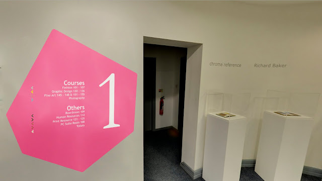
The pink mosaic with the floor number in it quite big (so it's visible from the distance in case someone is looking for this information) has the content divided in two: courses and others. I also made 2 categories because courses are the important ones for students, and the rest don't necessarily need individual categories: it would over complicate the design and might create confusion.

The content has to be re-organised so courses will be in alphabetical order and others will be organised by first facilities, second offices, administration or other rooms and finally amenities.

The pictograms in the arrows in the mosaic should be separated from the arrows and make them bigger for an easier recognition. Increasing the space between lines should allow to make pictograms bigger.


Leaving just an arrow for the courses would create confusion and it would be very frustrating for color blind people, so an addition of some text where the circle is in the others should help with the identification.


This approach is clearer and more aesthetic than the first one. Although, it has some problems like visibility from certain angles of the corridor and the signage of each floor doesn't say what's on the other floors. I took these questions to the Feedback sessions, and I got very useful suggestions.

One of them was to add small mosaics above and below the big one that shown what is on the other floors. In that way the big pink pictogram would be easily recognisable as the pictogram of that particular floor while the other information would be also displayed. Black might be a good choice for the colour of these little ones, that can't be too small, or legibility would be a problem.

Making the arrows in 3D, coming out a bit from the wall, was another suggestion that could make them visible from certain blind spots in the corridors. Also painting the doors of certain colours might improve the way-finding experience.


Thursday 3 December 2015

Ideas Generation

These are the sketches I have done from loosen ideas I have been writing down as notes.

I think the use of lights is important, as Ikea wayfinding system, but I think it is not very functional unless departments change all the time, which is something is not going to happen. But if it does, it would be something to consider, as it is not only flexible and cheap, but it also allows to use colours and multiple shapes.

I also noticed while identifying wayfinding systems in LCA that Graphic Design is the only department with a coloured light (and the offices below). I think that instead of using it as a decorative element it could have wayfinding purposes.

The colours assigned in the sketches are just examples.


I also considered using the student advice signage and take it to the next level using colours to indicate more things in the building. But it would be confusing as there would be loads of text and colours on the walls, which can be a quite stressing experience as well. Colours and shapes are much easier to identify and relate. During the photoshop workshops, a image caught my attention: a wayfinding system done by lines.


After the Peter & Paul talk and how the mosaic theme was explained these two ideas started to mix in my head.


By using a repetitive pattern to make it as long as it needs to be and using the colour of the assigned department it could be used throughout the building and it would be not only very easy to identify, but also within the theme of the building. It would be placed on the eye level (1.60 - 1.80 m from the floor). The colour of these mosaics would match with the light in the destination.

There is a potential problem that has a solution: i
f the line of mosaics is on the left wall and there is a corridor to the right it can go from one wall to another by crossing it through the ceiling. In this way the wayfinding system would be involving and it would have a much less appearance proper of a corporation. Students of art want to have an exciting experience during their studies and want to have a different life from what is sadly considered "normal lives". Ergo normal and regular wayfinding systems are out of question.


I also made sketches for the symbols to be used in the signage next to the text that relates to the mosaics for even an easier identification and without the need of reading everything. The text should have a secondary function to support the understanding of imagery. I used the grid supplied in Study Task 2 to design these pictograms.


A way to inform the audience how to quickly know what they can find where they are can be made using the principle of this example. This image can be particularly helpful and using the mosaic theme, this information can be put on the floor of each level of the building, in the stairs. It should be easy to spot as it is visible when coming from either downstairs or upstairs. A big number on a wall next to this signage will be displayed so the user doesn't need to look to the floor every time to find out where he is, but a big number that is part of the surroundings itself will let him know straight away even by not looking at it.

A colour should be saved for this signage from the college colour palette (found in the Brand Guidance PDF that I cannot post here) for this particular signage. Probably the most adequate for its contrast is the pink, which is also used in the website. It could be a way to standardise the colour for the college rather than using it for a particular department.


The mosaics will be used only to help finding certain departments. Although, it won't be used for every part of the building. For instance, the lecture theatre, needs a symbol and a colour assigned. This system of arrows can be used, but it needs to be consistent with the rest of the design and using colours or shapes that don't interfere with the rest of the wayfinding system.


After experimenting with arrows with mosaic shapes I concluded it could be confusing and hard to identify arrows like that among so many mosaics. Then looking through many different kinds of arrows a minimalist design should simplify the message. I also tried with simple lines and arrows, but it can still be confusing. Using big arrows on the wall and with long separation between them should make the experience of finding these places easier and they will not be confused with departments, as the wayfinding system is radically different, but consistent. The big arrows can be displayed not only on the walls, but on the floors as well as long as there is no rug.

Visual research

I have been doing some visual research that might be useful to be applied to the LCA wayfinding system. These are examples of practical and alternative signage that can take a step away from more corporative choices.


Folds

In this Study Task, after checking some publications that used folding methods, I used the book 'How to Fold' published by Agile Rabbit as it has innumerable ways of folding and they are exposed with simple instructions.

I chose one in particular that let the user to discover the content while unfolding, having a whole page at the end and allowing the designer to distribute the information properly as it has 6 small faces divided by 2 sides and the final big one.


This task allowed me to better identify what my small publication is going to be about and the layout of it.

Symbols

Before starting to draw sketches I decided first to do a little bit of research about some pictograms in different olympic games. Results were quite varied and I was surprised about how the same idea for the same purpose can be designed in so many different ways.


London 2012

Athens 2004
 
Beijing 2008
Moscow 1980
Munich 1982


I decided I would do a pictogram of a Scottish bagpiper, since it's something I always liked. I first checked the book Symbols that I bought some weeks ago to see what ideas could be interesting for this kind of designs.


The one at the bottom-left of the page looks similar to a bagpiper

At this point I realised one more time that the simpler the more effective. Simpler shapes were easier to identify. If more complicated shapes were chosen the result would be like Beijing olympics, which had some un-recognisable pictograms.

Then I went to google images to see what elements of a bagpiper I had to represent.
Examples of very effective use of negative space
Simple idea but less elements that can be recognisable in a pictogram.

A more martial look: The hat, the band on the chest, the kilt and sporran makes the bagpiper.

Using the supplied grid I started to draw sketches basing my practice in 1982 Munich olympics. Specifically, the archer, as it is not just a human body, but also an instrument.


After some experimentation it was clear that I had to decide whether the bagpiper would be represented from the front or from a side. I chose from a side, since the drones of the bagpipe would have been more easily represented, with the only cost of the band on the chest.


I didn't entirely stick to the lines of the grid because otherwise spaces would have been too big. Although, I only cut distances by drawing strokes using half of squares instead of the whole.

Once I vectorised it on Illustrator I used different colours to represent it as something Scottish. A possible audience for this kind of pictograms could be tourists in Scotland or signage to indicate where a school of bagpipes is.

As extra elements I added the bag of the bagpipe in negative space, the chanter of it and I made the back of the head plain, so it looks like is looking at the left.


Colours of Scottish traditional fabric

Dashed stroke to simulate stitches of the fabric


Scottish flag colours