Idea generation
The publication is going to be about 'The smoker of the future'. The name was changed to 'The perfect smoker' in order to make it friendlier and engaging to read through and also to avoid situations where the audience might feel rejection when seeing something related to stop smoking.
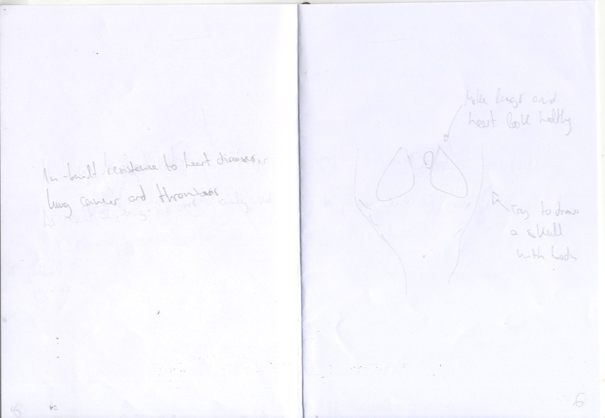
The key facts the advert communicates is the evolution of the smoker is scary, ugly and creepy, nothing good can come from smoking, focusing on the evolution of the eyes, chest, fingers, nose and eyebrows.
Doing some research it's been impossible to find data about any study related to this evolution. So in order to do the infographics, some information about how unhealthy smoking is and how healthy is to stop will be shown at the last page of the book, so it doesn't finish with all the negativity, but it also has a positive message.
The tone of voice is going to be kept because of it's originality in the approach to the problem and the expectation that can be portrayed in the publication. This is going to be done by showing the different key facts of evolution. First those that might make think that smoking is something positive, the less graphics, and then those that show how horrible the perfect smoker would be.
The target audience is young people, as 2/3 of smokers start at the age of 15 to 18 and those are more likely to believe in evolution. The info for the infographics is taken from stopmysmoking.com and ash.org.uk.
The delivery would be done through GP services (finding a tobacco package there would be an interesting experience), High Schools (same) and it can even be given away in the street. Smokers would be attracted as it looks like free tobacco.
Other considerations are to make the images as 2 colour vectorised illustrations from images of the video, make the publication go darker as the pages pass by and to use futuristic dystopian colours. This vectorisation should convey the same visual information as the video but making the printing cost really cheap. The original title might be brought back in order to bring back the dystopian feeling. If the publication goes inside the tobacco package, it could have the cigarettes illustrated on the top to make it even more engaging.


The order of how information is going to be shown is thought to create expectation: Starts positive saying why is good for evolution to keep smoking, follows negative to show what is the reality and ends with a positive message about the benefits of stop smoking now. It will follow a similar narrative to the video but saving the whole face for the end and show the parts of the body in a way that it is only revealed near the end.
To show the benefits of stopping smoking, there will be a timeline inspired in Vignelli's concept of subway system, which it doesn't really matter how much time passes between the facts, as the purpose is not to show time in a graphical way, but to show the facts one after another. As the space is limited and the type size needs to stay as it is, otherwise it would be difficult to read, a system of boxes will contain the information and it will be placed like body text. This is a way to ensure that the reader distinguishes what information belongs to what point that is being made.
Research
As the publication is going to be quite obscure I was looking for something similar. "Rolls Royce Ghost" booklet might be similar to what an obscure publication may look like without the 'luxurious component.
But the first thing that was done once the content was almost definitive, was a sketch of the book to identify what needed to be done. The order of the pages and some illustrations are subject to changes.


The part that needed more time to identify was the size of the paper. A list of requirements were written down:
- It needs to fit in a pocket (this was a useful suggestion from crits session)
- It needs to fit in a pocket (this was a useful suggestion from crits session)
.
- Less height than A sizes proportions. So much space is not needed.
- Vertical or horizontal it's something that needs to be tested to be clarified.
- Not too thick, so it can be easily open.
- 1/2 Marching Band Flip-Folder is a bit bigger than a business card. This size is good to carry in the pocket, people won't mind to take them and have a look later.
- Vertical or horizontal it's something that needs to be tested to be clarified.
- Not too thick, so it can be easily open.
- 1/2 Marching Band Flip-Folder is a bit bigger than a business card. This size is good to carry in the pocket, people won't mind to take them and have a look later.
- A booklet of this size is also more friendly and engaging, since it's going to be in GP's, Highshools, etc and they look an unusual publication.
- Small size also conveys easy and fast reading experience, while bigger ones might make think they take time to go through. Teenagers normaly "don't have time" for those things.
- Despite scary content, the publication must be friendly.
After having this list a peer suggested that a leaflet could be put in a fictional tobacco package. So then, a real package was analysed and measured in order to know the size of the publication. After calculations, and to leave some space so the leaflet is not tight inside, the ideal publication would consist in 75x55 mm.
After having this list a peer suggested that a leaflet could be put in a fictional tobacco package. So then, a real package was analysed and measured in order to know the size of the publication. After calculations, and to leave some space so the leaflet is not tight inside, the ideal publication would consist in 75x55 mm.


With the measures from the package I made some mock ups with post-its and regular paper were made to see if the dimensions and assemble were correct. No problems at this stage.


Inspiration for illustrations: http://theinspirationgrid.com/illustrations-by-jack-hughes/
https://www.behance.net/gallery/29538525/New-Nordic-Fashion-Illustrations
https://www.behance.net/gallery/24844939/editorials-4
Some pictures of examples:


Those designs that are drawn with more precission they look clean and friendly. Since this project looks to do the opposite, the vectorisation will be a bit messy to convey the original creepiness. As the images in the ad use lighting from a side, the outcomes will be similar to the image of the Oscar.
Production
Once on the computer and after trying different ways to show the title (and trying both titles) the title with an underline in orange and white simulating the cigarette seemed the most appropriate choice. The orange colour is Pantone 143 U, which is the most similar to the filter of a cigarette.

While vectorising the images they were showed to other people to see if they were recognisable. Simpler shapes were easier to identify than more complicated ones. So once the shape was taken from the original image, extra details were added afterwards to make the shapes more recognisable, but keeping the new shapes simple.
Only one colour was used: white in two opacities: 100% and 20%, so the illustrations would have a bit more depth. The negative space is also considered to draw shapes, which will also be positive in printing costs and it lets the audience enjoy the uniqueness of the paper, which will be the model Twist from G. F. Smith in black. Unfortunately, it seems in college is not possible to print in white ink, so what I might do is to only print the background and invert the negative space. Although, the cover is going to be regular coated thick paper (probably 200gsm) to make it stand out from the rest of the content and give the sensation of holding it.
After trying different typefaces I was recommended in crits to use an Helvetica to avoid a formal tone of voice. The chosen typeface is Futura, which has an authoritarian as well as a futuristic feeling that is enough to represent that dystopia.
Doing some tests in the digital printing room I found out that the printer weren't printing the pantone colours I was using on the paper I got from G. F. Smith, so I decided to leave it black, since the final effect is not plain at all. All the opposite: it is full of ranges of grey. The only problem with the paper is that the effect is not on boths sides of it, so I had to paste two papers from the back to make it work, making the book much thicker than expected. It stays open when left on the table, but since it is going to be in a box, that shouldn't be a major problem


To be able to print the booklet for staple binding I realised I had to have a number of pages multiple of 4, so I added two extra pages at the end with a final message: "Evolution is not a choice - How we evolve is". It makes the audience think about something bigger than oneself: the human being. In design allows to make this process by printing it as a booklet and exporting it as a PDF, but since I wanted to print several pages in one A4 I ordered them manually. To do this, I made a quick mock up with regular paper and numbered it. Then, taking the papers individually, I used the numbers I wrote when the "booklet" was assembled. So I exported the pages individually from InDesign and put them together in the order the little mock up I made indicated me.


After printing it I just had to cut the different pieces and put them together as the mock up marked.


What I could see from the test is that the ink doesn't stick very well to the paper, but it increases the feelings of being touching something that it's tearing apart. I accidentally printed the cover backwards, which had an easy solution. The problem came when cutting the edges to make them even: they were irregular as a result of the thickness of the paper and the type of binding. I have tried to solve this problem but I don't know how yet and I am not sure if I will be able to do it on time.
Picture of baby used for vectorisation: baby as art (carrie sandoval) https://s-media-cache-ak0.pinimg.com/736x/4a/74/bb/4a74bb2aef924c5f9aae8c3b4c09ae7a.jpg


