When this brief was presented I saw a great opportunity to do what I feel more comfortable with, which is design on screen, and proof myself what is the path I should take in my career as graphic designer.
The first ideas that came to my mind were examples of bad user interface or experience design, such as No Man's Sky inventory interaction or controls, or making a new app based on a gadget that appears in an episode of Black Mirror, which consisted in transferring contact info contactless, just putting one phone next to another.
But focusing on something I use everyday, it is imperative to name Netflix. Its simplicity makes me feel that I don't have control over it, not a very positive characteristic of an UX. The simplicity that characterises Netflix might have crossed the line where it is not helping making things easier, but it feels limiting instead.
After giving it a think, I've considered other film based platforms that are not in competence with Netflix that could improve the current experience and make it more engaging and interactive while also keeping the simplicity other people might find pleasant.
Monday 14 November 2016
Sunday 6 November 2016
Typeface in Context - Evaluation
The final result wasn't the most engaging or best designed product, but making a book (as a more screen-based designer) in such short period of time has been a challenge with valuable lessons that can be used in other types of design.
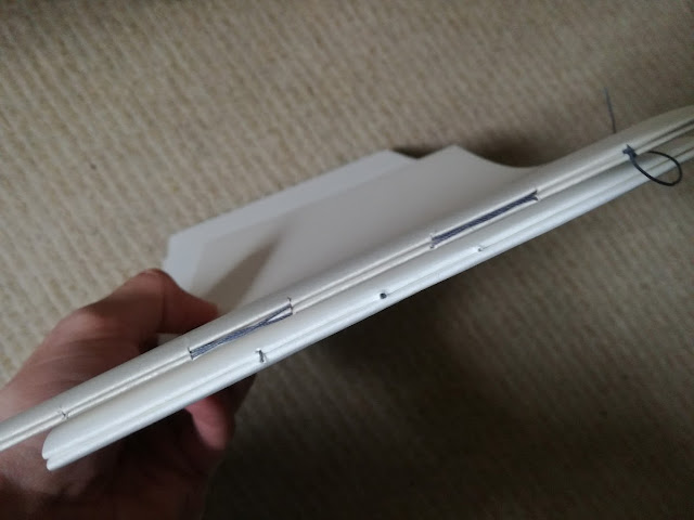
During this process, the printed pages on this stock are quite damaged by the stitch binding. This could have been solved by not placing the full bleed images in the center pages of the signature.
Also, a more acid and bright tone of yellow for the cover, not so orange, would have conveyed more criticalism and less charmness. But at the same time, the design was aiming to be friendly in the tone of voice.
In order to stick to that ‘protest’ style, the cover could have been designed using a stencil and spray on it. This would have given a graffiti look to it, which is also related to protest. Unfortunately, this idea arrives late, as the earliest lasercut induction available is the 9th of November, days after the deadline.
(Add Nick's FB + filling typeface with colour)
Summative feedback
The quotes make the book flow, but more quotes would have worked better (at least 4, 1 between each signature to make the book flow more). One of the 2 existing quotes is misplaced. It was supposed to fall between the first and the second signature, but a mistake in inDesgin made that happen.
Case bound would have been a better choice instead of a book that needs to lay flat, as it is not intended to be a coffee table book and holding it is problematic.
Screenprint works very well.
Spine is a bit too thick.
The book is charmign
Purpose achieved, balance between humor and being critical
Very good size justification
In order to stick to that ‘protest’ style, the cover can be laser-cut to create an stencil and spray on it. This would give to it a graffiti look, which is also related to protest. Unfortunately, this idea arrives late, as the earliest induction available is the 9th of November, days after the deadline.
Saturday 5 November 2016
Typeface in context - Feedback + final production
The feedback session that took place the 28th of October helped not only to clarify doubts about how to make the book more engaging, but also to identify what was missing in the original approach.
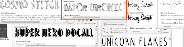
In order to improve the design, there were suggestions to avoid the use of Comic Sans not because of the history behind the font, but because it might be not understood. It is quite ambiguous and it might not properly show what is my position in this conflict. If the purpose of the publication is to poke fun at the concept of originality, maybe that's not the best way. Research into kitsch, cute and gaudy design, which tends to be more critical, led me to remember one designer, Ian Stevenson, who makes a great use of design for critical thinkers using typeface that is kind of restless and witty. Then, researching into typefaces, handwritten and with irregularities that conveyed inquietude. These are some pictures of the ones considered.
The text for the titles in the two sections of the book (the preface and the glossary) were placed like that following the Vignelli Canon.
Also, the photographs seemed to be dragging more attention than the shop signs instead. At first, the intention was to make the reader feel like being in the place with full bleed images, but what this actually did is to make the audience to contemplate the photographs. They are not supposed to be enjoyed, but critisised and analysed. Presenting the photographs on a white background, like in a museum, should make this happen despite how reluctant I was at the beginning.
The concept was also slightly changed. At the beginning, it was about how originality was a corrupted word and how everything gets repetitive in a certain place. During the crits, someone pointed out that the images looked exotic to them, but to me they look boring and tedious. Then a new question arises: is actually a lack of originality a sign of identity? This new question was more friendly and less snob, but keeping the critical thinking and an openness for interpretation. The preface was changed as well as the whole tone of voice throughout the book.
Peers suggested to leave the images full bleed, that they were nice to see. This made me realise that the images were actually taking the audience away from the main content, which was the shop signs. Also, in order to avoid distractions, instead of the boxes and to completely avoid unconscious reading (despite the text is upside down it can be equally read) a glossary at the end would help solving this problem.
The addition of the glossary made the design to increase the number of pages (by 4 at least, in order to keep a number of pages multiple of 4). This resulted in other changes:
- The increase of signatures from 2 to 3. Previously there were 2 signatures of 4 sheets per signature. 5 sheets in one signature and 4 in the other would be an unbalance. So the number of signatures was increased to 3 with 3 sheets per signature.
- This change allows to keep the 2 images using two pages and an addition of extra content as a break between all those photographs. Looking at photograph after photograph can be repetitive and the attention can go away. In order to keep it, some full bleed coloured pages with quotes about how the concept of originality isn't quite so obvious will be added in the pages between signatures. The colours used were the same Pantone used for the beginning and the end of the book as well as the digital design of the cover.
After reading many quotes, the ones identified for being the best fit for the book were by Chuck Palahniuk and Marie Antoniette. Just the quotes and names seemed quite empty. To add more playfulness and to keep with the aesthetic of the typefaces, the design could have hand drawn portraits with this thoughtless type of drawing. After trying it, the design looks more complete and consistent. A consistency that was re-inforced by limiting the use of colours identifying with the pantone book the stock that was going to use for the book.
These are the chosen colours are the ones matching the materials, and as it's previously explained, they have been applied on the InDesign project. They are Panton 122 U, 214 U and 341 U. They were identified using uncoated samples as the book is going to be printed on uncoated stock and the endpapers are also uncoated.

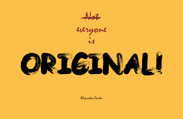
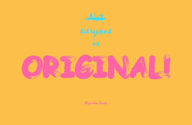
The title was usable for this new concept, as not only points out the juxtaposition, but the debate open for the two positions represented by colours: "is it good to be unoriginal? or graphic designers are necessary?", one correcting and crossing the other one.
This book could be perfectly produced commercially. There is machinery design to stitchbind books as there are many examples of commercial books carrying this method. The content of the book has been digitally printed and the cover follows a basic procedure. Screenprinting is a process that can be repeated as many times as needed.


In order to improve the design, there were suggestions to avoid the use of Comic Sans not because of the history behind the font, but because it might be not understood. It is quite ambiguous and it might not properly show what is my position in this conflict. If the purpose of the publication is to poke fun at the concept of originality, maybe that's not the best way. Research into kitsch, cute and gaudy design, which tends to be more critical, led me to remember one designer, Ian Stevenson, who makes a great use of design for critical thinkers using typeface that is kind of restless and witty. Then, researching into typefaces, handwritten and with irregularities that conveyed inquietude. These are some pictures of the ones considered.

The text for the titles in the two sections of the book (the preface and the glossary) were placed like that following the Vignelli Canon.
Also, the photographs seemed to be dragging more attention than the shop signs instead. At first, the intention was to make the reader feel like being in the place with full bleed images, but what this actually did is to make the audience to contemplate the photographs. They are not supposed to be enjoyed, but critisised and analysed. Presenting the photographs on a white background, like in a museum, should make this happen despite how reluctant I was at the beginning.
The concept was also slightly changed. At the beginning, it was about how originality was a corrupted word and how everything gets repetitive in a certain place. During the crits, someone pointed out that the images looked exotic to them, but to me they look boring and tedious. Then a new question arises: is actually a lack of originality a sign of identity? This new question was more friendly and less snob, but keeping the critical thinking and an openness for interpretation. The preface was changed as well as the whole tone of voice throughout the book.
Peers suggested to leave the images full bleed, that they were nice to see. This made me realise that the images were actually taking the audience away from the main content, which was the shop signs. Also, in order to avoid distractions, instead of the boxes and to completely avoid unconscious reading (despite the text is upside down it can be equally read) a glossary at the end would help solving this problem.
The addition of the glossary made the design to increase the number of pages (by 4 at least, in order to keep a number of pages multiple of 4). This resulted in other changes:
- The increase of signatures from 2 to 3. Previously there were 2 signatures of 4 sheets per signature. 5 sheets in one signature and 4 in the other would be an unbalance. So the number of signatures was increased to 3 with 3 sheets per signature.
- This change allows to keep the 2 images using two pages and an addition of extra content as a break between all those photographs. Looking at photograph after photograph can be repetitive and the attention can go away. In order to keep it, some full bleed coloured pages with quotes about how the concept of originality isn't quite so obvious will be added in the pages between signatures. The colours used were the same Pantone used for the beginning and the end of the book as well as the digital design of the cover.
After reading many quotes, the ones identified for being the best fit for the book were by Chuck Palahniuk and Marie Antoniette. Just the quotes and names seemed quite empty. To add more playfulness and to keep with the aesthetic of the typefaces, the design could have hand drawn portraits with this thoughtless type of drawing. After trying it, the design looks more complete and consistent. A consistency that was re-inforced by limiting the use of colours identifying with the pantone book the stock that was going to use for the book.
These are the chosen colours are the ones matching the materials, and as it's previously explained, they have been applied on the InDesign project. They are Panton 122 U, 214 U and 341 U. They were identified using uncoated samples as the book is going to be printed on uncoated stock and the endpapers are also uncoated.

The title was usable for this new concept, as not only points out the juxtaposition, but the debate open for the two positions represented by colours: "is it good to be unoriginal? or graphic designers are necessary?", one correcting and crossing the other one.
This book could be perfectly produced commercially. There is machinery design to stitchbind books as there are many examples of commercial books carrying this method. The content of the book has been digitally printed and the cover follows a basic procedure. Screenprinting is a process that can be repeated as many times as needed.


Type in context - Production
Before getting into the production of the book, the bookbinding induction helped to better identify what binding method the book should have. It was a good opportunity not just to make a book and refresh knowledge, but also to see other examples.
The book is going to follow a simple structure. An introduction to place the reader within a context and the images to be viewed. The photographs are going to be displayed in full bleed, so the reader can better picture how it is to be there. Photographs with a frame are probably not the best answer for this purpose.
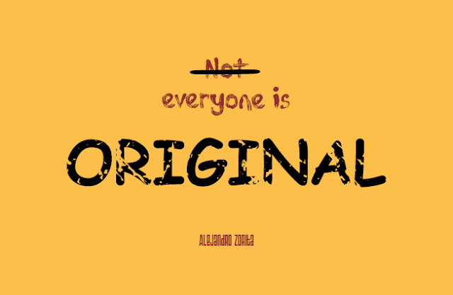
The only typeface to be considered in the book is the one used for the introduction and the cover of the book. After trying different typefaces like Times, Helvetica, Garamond or Century Gothic the text looks more impersonal, like a voice over, in Garamond. For the cover, original is the main word, so it needs to be seen. The use of Comic Sans can be also a good idea, as it is the yuxtaposition of the word original with the history of the typeface. And since this publication is about typeface, the context is consistent with the use of this controversial typeface. Also, the overused design of "Keep calm and..." was considered for the cover, but it would have blended in instead of standing out. Along side of Comic Sans, Mistral seemed to be a good combination because of its similarity of relaxed styles and the contrast of being sans-serif.
The book was supposed to be named "Everyone is original", but adding the "not" crossed at the beginning would point out the juxtaposition of the different understandings of originality.
Before deciding what colour was going to use for the design, the design went through several combinations to see what was the best choice as well as adding more elements (or not) to the cover.


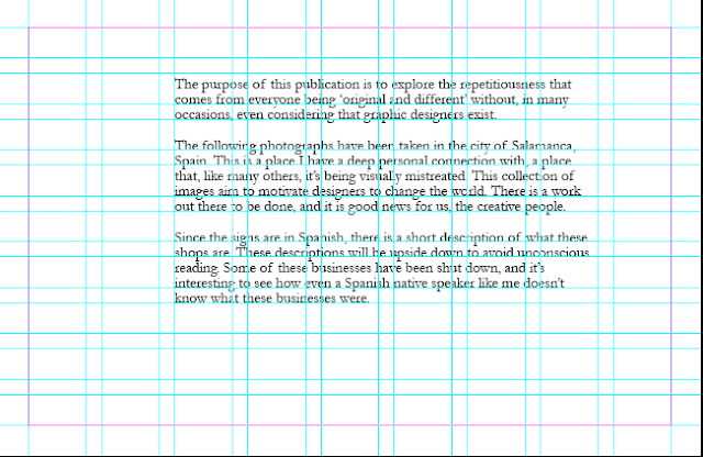
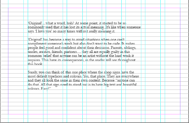
The grid system used is based on the Vignelli canon, but of course customised for the size of the publication, which is 230mmx150mm (an octavo). The baseline grid, used for blocks of text, has a separation of 5mm. The margins are 10 mm from the borders and there is a 3mm bleed area. This was calculated after failing in trying to fit a baseline grid within the guides without keeping in mind the proportions between these. The grid is 9x9 with a gutter of 5mm, like the baseline grid. This ensures the layout will rest in harmony with the baseline grid.
The font size is also affected by this math. Being 5mm for body text, 10 for titles, and so on.
When looking into psychology of colours to identify which one could work better for the book cover, yellow is a colour that conveys a critical mindset. In Empower Yourself With Colour Psychology they described it as: "Yellow has a tendency to make you more mentally analytical and critical - this includes being self critical as well as critical of others".
It was a bit overwhelming to see how many of these materials and posibilities there are for a book cover. After looking into several materials for the book cover and due to the nature of this publication, the outside shouldn't be over-designed or the content might seem disappointing. The printroom staff also helped to identify the material needed for this publication. It was collected at Vernon Street.
Once the material was collected and tested, the Pantone book was useful to identify the colour of the material. This combined with colour combination theory and the app Coolors was a great way to quickly test different colours and find the look that worked best.

There is also a copy of the title in black and white at the beginning of the book in case the book cover gets deteriorated with the time.
The book cover is going to be produced using screenprint as it is a method that printroom staff has confirmed that works on this surface and can replicate exactly what's in the in design file.
In order to stick to that 'protest' style, the cover can be laser-cut to create an stencil and spray on it. This would give to it a graffiti look, which is also related to protest. Unfortunately, this idea arrives late, as the earliest induction available is the 9th of November, days after the deadline.
To solve this problem, the cover will be screenprinted with an effect of something done manually. Different effects were tried as well as other typeface combinations. Some of these fonts are Tajamuka Script, Acki Preschool and Triac 71.
Initially, the book was going to have 3 signatures. But the number of the final pages makes them fit better in two signatures. The center of those two signatures is going to be used for the pictures that use two pages, so they can be fully viewed.
The position of the signs within the grid are based on two principles: trying to keep a symmetry on both sides and trying to follow the rule of the thirds to know where the signs should be displayed. This is so the eye focuses on the shop signs instead of anything else.

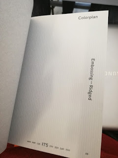
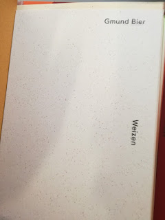
At this point in time, the designed seems quite dull and primitive. Different stocks from G.F Smith were considered at this time to be added in the book, like Ridged or Weizen paper (not available online in sizes bigger than A4). The design could be richer, and this concern was taken to Simon Jones, who believed that there was starting to be a tendency to overdesign this book, which would have a negative impact in the final outcome as the design itself would be the main protagonist.
So in order to avoid this, the application of different stocks were limited to the beginning and the end of the book, where the signatures need to be glued to the covers.
Once the images were ready to be printed, they were adjusted following the procedure taught in the indesign inductions, where the images are in CMYK (manually adjusting the colours to avoid Photoshop misinterpretations), size adjustment and conversion from 72 to 300 ppi.
Few hours before printing the last mock up, as a rushed idea there were added white boxes for text that reveals what the shop sign is about, but they were upside down, so the reader would have to turn it around to read it and to avoid unconscious automatic reading. This was to make the book more interesting, since what was happening is that the book wasn't interesting for trying to make the pictures look repetitive and boring. This two concepts need to be separated: the book needs to be interesting, but not the pictures.
Different tests were printed on matte (200 and 120 gsm) and glossy (115 gsm) white stock. This helped to identify what stock was the most appropriate for the publication. The matte 200gsm was perfect to convey the conservative and rough look Salamanca has.
Also, the printroom staff helped once again identifying the best binding method for two signatures.
The book is going to follow a simple structure. An introduction to place the reader within a context and the images to be viewed. The photographs are going to be displayed in full bleed, so the reader can better picture how it is to be there. Photographs with a frame are probably not the best answer for this purpose.
The only typeface to be considered in the book is the one used for the introduction and the cover of the book. After trying different typefaces like Times, Helvetica, Garamond or Century Gothic the text looks more impersonal, like a voice over, in Garamond. For the cover, original is the main word, so it needs to be seen. The use of Comic Sans can be also a good idea, as it is the yuxtaposition of the word original with the history of the typeface. And since this publication is about typeface, the context is consistent with the use of this controversial typeface. Also, the overused design of "Keep calm and..." was considered for the cover, but it would have blended in instead of standing out. Along side of Comic Sans, Mistral seemed to be a good combination because of its similarity of relaxed styles and the contrast of being sans-serif.
The book was supposed to be named "Everyone is original", but adding the "not" crossed at the beginning would point out the juxtaposition of the different understandings of originality.
Before deciding what colour was going to use for the design, the design went through several combinations to see what was the best choice as well as adding more elements (or not) to the cover.


The grid system used is based on the Vignelli canon, but of course customised for the size of the publication, which is 230mmx150mm (an octavo). The baseline grid, used for blocks of text, has a separation of 5mm. The margins are 10 mm from the borders and there is a 3mm bleed area. This was calculated after failing in trying to fit a baseline grid within the guides without keeping in mind the proportions between these. The grid is 9x9 with a gutter of 5mm, like the baseline grid. This ensures the layout will rest in harmony with the baseline grid.


The font size is also affected by this math. Being 5mm for body text, 10 for titles, and so on.
When looking into psychology of colours to identify which one could work better for the book cover, yellow is a colour that conveys a critical mindset. In Empower Yourself With Colour Psychology they described it as: "Yellow has a tendency to make you more mentally analytical and critical - this includes being self critical as well as critical of others".
It was a bit overwhelming to see how many of these materials and posibilities there are for a book cover. After looking into several materials for the book cover and due to the nature of this publication, the outside shouldn't be over-designed or the content might seem disappointing. The printroom staff also helped to identify the material needed for this publication. It was collected at Vernon Street.
Once the material was collected and tested, the Pantone book was useful to identify the colour of the material. This combined with colour combination theory and the app Coolors was a great way to quickly test different colours and find the look that worked best.

There is also a copy of the title in black and white at the beginning of the book in case the book cover gets deteriorated with the time.
The book cover is going to be produced using screenprint as it is a method that printroom staff has confirmed that works on this surface and can replicate exactly what's in the in design file.
In order to stick to that 'protest' style, the cover can be laser-cut to create an stencil and spray on it. This would give to it a graffiti look, which is also related to protest. Unfortunately, this idea arrives late, as the earliest induction available is the 9th of November, days after the deadline.
To solve this problem, the cover will be screenprinted with an effect of something done manually. Different effects were tried as well as other typeface combinations. Some of these fonts are Tajamuka Script, Acki Preschool and Triac 71.


Initially, the book was going to have 3 signatures. But the number of the final pages makes them fit better in two signatures. The center of those two signatures is going to be used for the pictures that use two pages, so they can be fully viewed.
The position of the signs within the grid are based on two principles: trying to keep a symmetry on both sides and trying to follow the rule of the thirds to know where the signs should be displayed. This is so the eye focuses on the shop signs instead of anything else.

At this point in time, the designed seems quite dull and primitive. Different stocks from G.F Smith were considered at this time to be added in the book, like Ridged or Weizen paper (not available online in sizes bigger than A4). The design could be richer, and this concern was taken to Simon Jones, who believed that there was starting to be a tendency to overdesign this book, which would have a negative impact in the final outcome as the design itself would be the main protagonist.


So in order to avoid this, the application of different stocks were limited to the beginning and the end of the book, where the signatures need to be glued to the covers.
Once the images were ready to be printed, they were adjusted following the procedure taught in the indesign inductions, where the images are in CMYK (manually adjusting the colours to avoid Photoshop misinterpretations), size adjustment and conversion from 72 to 300 ppi.
Few hours before printing the last mock up, as a rushed idea there were added white boxes for text that reveals what the shop sign is about, but they were upside down, so the reader would have to turn it around to read it and to avoid unconscious automatic reading. This was to make the book more interesting, since what was happening is that the book wasn't interesting for trying to make the pictures look repetitive and boring. This two concepts need to be separated: the book needs to be interesting, but not the pictures.

Different tests were printed on matte (200 and 120 gsm) and glossy (115 gsm) white stock. This helped to identify what stock was the most appropriate for the publication. The matte 200gsm was perfect to convey the conservative and rough look Salamanca has.
Also, the printroom staff helped once again identifying the best binding method for two signatures.

Wednesday 2 November 2016
Typeface in context - Production Schedule
Week 1
10/10 Write intro for the book. Keep working on it in the upcoming days.
11/10 Book the printing slot for the 28th of october, so I have one more week to take pictures and correct mistakes.
12/10 Attend to the foiling, flocking, embossing and debossing induction.
13-15/10 Correction of images just to give them a more professional look. Nothing that makes them look interesting.
16/10 Mock up the binding method that is potentially going to be used.
Week 2
17/10 Use a big paper in studio to identify what size for the book is going to work best.
18/10 Start In-Design project and find out how to print something for a sandwich binding publication.
19/10 Attend to the bookbinding refresh induction. Ask about how to make a hard cover for a sandwich binding and see if the current idea can be improved.
20/10 Do a new mock up with the stock from GF Smith and order new stock for another mock up and the publication. (Stock from GF Smith didn't arrive)
21/10 -Busy at Broadening horizons workshop-
22/10 Design the cover of the book and find a right system of grids and layout
23/10 With a mock up, identify the central pages for the two panoramic images in the book.
Week 3
24/10 Prepare the screen to screenprint the cover once the book is finished. Book lasercut induction for new idea (out of time, 9th of November)
25/10 Create a final mock up. Try drawing the letters
26/10 By this point the book should be finalised and small details should be polished
27/10 Have book ready to be printed out and screen to screenprint the cover.
28/10 Consider Feedback and apply it
Week 4
31/10 Prepare screen for screenprinting and collect the stock
1/11 Print final version and stitch it
2/11 Make book and screenprint cover
3/11 Finalise details
Subscribe to:
Posts (Atom)