Friday 17 February 2017

Orchard pig research and first ideas

The first thing we did is sitting together to analyse the brief and make notes on what Orchard Pig want for their project.


Some facts gathered from research:
- #rootedinsomerset
- Get aesthetics from website, which is very creative
- Use this kind of method to attract more people http://www.orchardpig.co.uk/2016/07/26/nailed-it/
- Type of content they share https://www.facebook.com/pg/OrchardPig/photos/?ref=page_internal
- Story of orchard pig: http://www.telegraph.co.uk/connect/small-business/how-to-set-up-a-cider-business/
- Studio that designed the brand: http://www.jollygoodshow.org/orchard-pig/

Some interesting information gathered from an interview:

A hobby that took over to become a job.

We also wanted the Orchard Pig to have attitude and be mischievous, bold and fun – all things that we plan to be as we grow.

I spent a few years working for consumer giants Mars and Bacardi-Martini. Both taught me the importance of the brand. A great product is key, but with a strong brand – knowledge of who you are, what you stand for and where you want to go – you’re more likely to succeed. So from day one, Orchard Pig has embodied a resilience to problems that arise and a bloody-mindedness never to accept the status quo.

A strong brand essence enabled us to sell people more than just cider; we gave them Orchard Pig’s attitude.

What else? Remember that when it comes to funding, it’s important not to chase every pound – some funding options simply aren’t right for every business. (They are not greedy)

It was born in a period of recession


In general, it's clear that they want the tone of voice to be youthful, funny and cheeky, encouraging consumers to buy British products (or from Somerset). This is for a branding campaign that works across different media. They insist they are a cider with the spirit of beers.

These are some of the ideas I put over the table doing some brainstorming:

3D model a pig for pubs entrance.
Bottle with the shape of a pig.
Be creative with packaging and everything physically involved with the process of getting a beer.
Fun and shareable (that people feel related to and want to share its message) animation for a gif in social media.
Pig leg for pour point
Pig themed funny face-in-hole boards for selfies
Badass pig
Water is for fishes.

MUBI: Production

After changing the background, making the illustrations and making all the text in the tone of gray MUBI specifies in their guidelines, the design started to get a new direction. Also, the format of the title was changed to what the guidelines said about the format.


The type of illustration was made simplistic but it didn't work very nicely. It needed to be more hipster. Looking through hipsters designs it was going to be difficult to make it look different from a hairdresser. The illustrations were also in many occasions very elaborated, which doesn't fit into my skillset. This was until this picture was found:


The idea of illustrating the elements previously shown in a sketchy way was pretty hipster, and if made right, could enhance the whole message. Taking advantage of my ineptitude as a drawer could be the answer for these illustrations. They are made on illustrator with a pencil brush so they can be resized if desired.

Also, the background pictures were adjusted in several ways: colours were changed to create more contrast. The substraction of black colour was also important for a more hipster and cosy look, but at the same time the whites needed to be reduced for the text to stand out more. This resulted in a less contrasted background, but colours had enough contrast to tell the lines apart.

As previously mentioned, the slogan changed from "Mubi night" to "It's Mubi night", which resulted in changing the format of the title. These are some examples of different experimentation with the title.


Once the illustrations were changed, quotes re-written and many other changes to make the new decisions work better together the outcome made more sense in conveying the message that was intended to from the beginning.

The whole design seemed to lack focus. After experimenting different options (like adding elements to drive the eye, changing the layout, etc) the background was changed to meet different purposes. One was to make a standard template, making the lines matching with the grid and sections division. After this, 8 different backgrounds for the 8 different posters were made just by changing the colours to similar colour palettes to the original blankets, as the blankets (as it has been pointed out) were made with wool leftovers and the colours not always work well together. To make more emphasis on the illustrations and to make the design less flat, the background was modified in such way that it frames the illustration and a TV with the logo of MUBI at the top seemed knitted. This was done by using layer masks and leaving the particular stitches, giving the sense that it is actually stitched. These irregular background emphasises even more the sense of imperfection that is normally understood from independent movies. Instead of running from it, the design embraces it as something positive, human and made with love and passion.

These are the final outcomes:


All the content used is free of copyright. The typeface (Helvetica Condensed) is the one they've specified in their guidelines and everything else has been created by me. The blankets, as mentioned, are hand-knitted, not commercially produced.


Preparing the entry


As for the name of this project (as it needs one for the submission) it is going to be called "Mubi nights".

The 100 words definition: Popcorn is to cinema what blankets are to home streaming media. This set of posters aims to convey the cosiness of watching a good independent film at home with witty ideas. MUBI's unique selling point is used in this project to let the most demanding audience know that there's a place for them where they don't have to go through hay to find needles or deal with an algorithm that brings them more hay just because that's what they've picked before.

MUBI: Development

MUBI has on its branding guidelines strict indications of how their typeface and layout should be used and there are different posters and examples that illustrate this. In order to stick to those rules, creating a template will be very helpful and will limit the design decisions, making the process move forward not only much smoother, but in the way the client has demanded.


With the layout already set, in the guidelines there are no restrictions regarding the background. One of the ideas was using the logotype magnified with the colours of the brand in different positions.


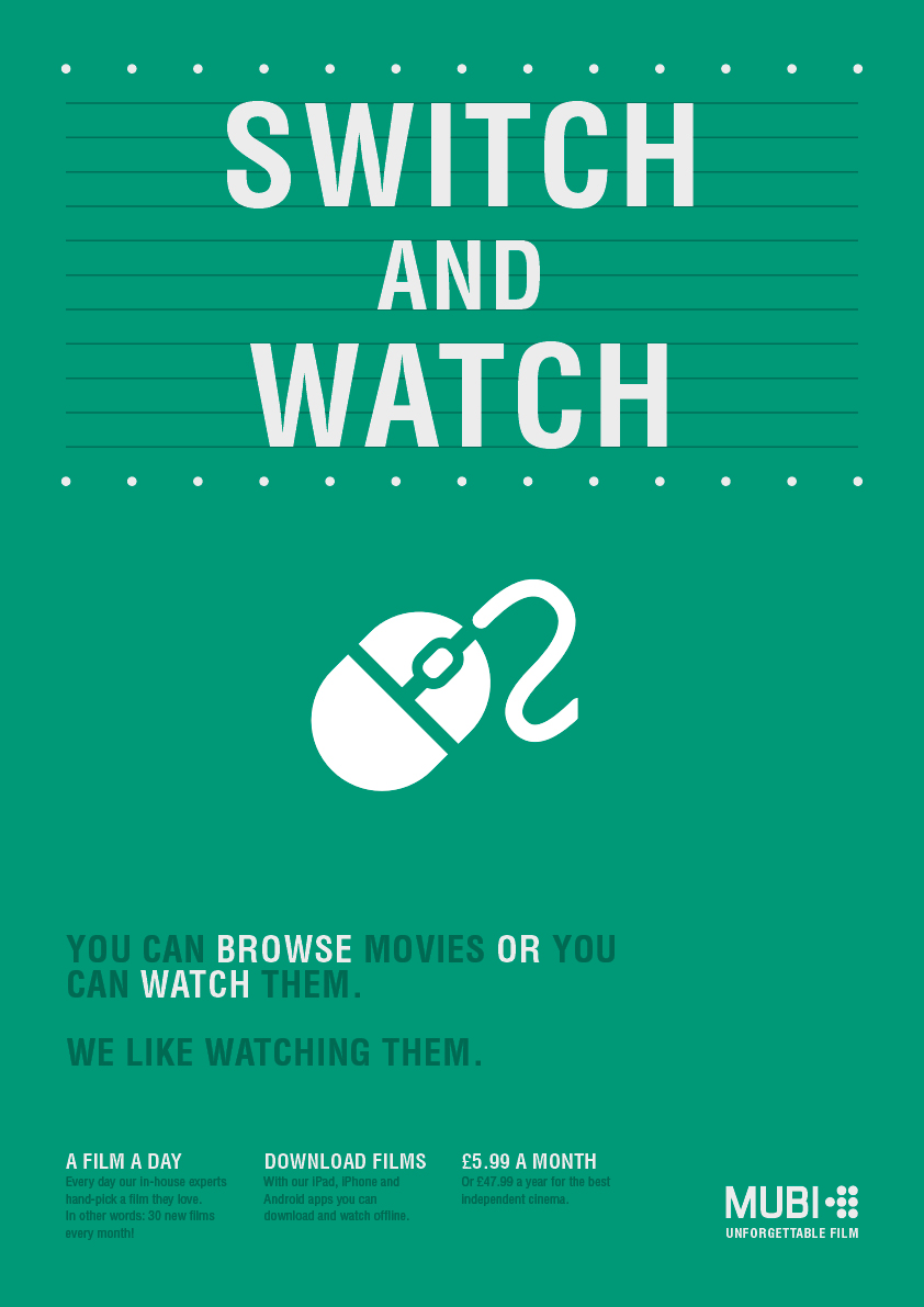
Also used the circles of the logo to represent bulbs of old cinemas. The circles are of the same size as the logo to keep the consistency of the design. This is to appeal the audiences with cultural interests as the brief indicates, bringing back the experience of going to the cinema to watch something amazing. The problem with this design is that it looked too flat when the intention was being minimalist to be in the lines of the examples they've shown in their guidelines. "Switch and Watch" was one of the slogans that were thought for this campaign. Other ideas for this were: "we roll, not scroll", "Don't scroll, just watch", "Just watch", "No more scrolling", etc.

Instead of using lines like in the previous example, they were removed to fill the gaps with more dots. This made the text stand out more. Also, the format the bottom text is written in is taken from the template earlier created.


With the headline and the extra information at the bottom the design needs a attention-grabber for the body of the poster.

For this purpose the design will show an image and a witty quote alongside with it. They are like little stories or clever points about the three points MUBI wants to address: the absence of scrolling time in MUBI, the overrated value of access to infinite content and the pointlessness of algorithms as a way of recommendation.

As the body is going to cover this aspects, "switch and watch" was changed for "Mubi Night", which later on was modified to "It's Mubi Night" as the "it's" informs the audience about something that is happening, a title that doesn't necessarily address the problem. Also, "movie night" is a common expression in English to refer to a night at home alone or with close friends to spend a time together watching a movie. I thought about using this as a way to take advantage of this commonly used expression as a way to get the brand into the culture, like it has happened intentionally or accidentally in the past . Some examples are "Netflix and chill", "Just do it", "There are some things money can't buy. For everything else, there's MasterCard", "I'm lovin' it", etc. Everytime someone says "Oh yeah, I'm lovin it" it's impossible not to think in Mc Donald's. The intention with this pun it's to create the same effect.

There will be different posters, and each one of them will have a different quote on it for the body. These are some of the quotes that has been selected after writing many and modifying them:

"WHY SPEND 4.9 DAYS A YEAR SCROLLING WHEN YOU CAN USE THAT TIME TO WATCH NEW CONTENT?" - With a picture of a computer mouse characterised saying: Leave me alone! Based on a series of videos that have become viral of everyday stuff with faces on it. This is the type of illustration that was used because of its friendly and widely accepted look.

"YOU WILL ONLY NEED ONE BUTTON" - This quote will go alongside a picture of a tv controller with only one button: play.

"AN ALGORITHM GIVES YOU HAY WHEN YOU NEED A NEEDLE. WE ONLY GIVE YOU THE BEST NEEDLES"- Showing a haystack or needles to support the quote.

Others are "BROWSING IS COOL, WATCHING IS BETTER", "YOU WATCH IT OR YOU MISS IT. NO TIME FOR BROWSING", "SAY NO TO SCROLLING, YOUR MIDDLE FINGER WILL THANK YOU", etc.

In these designs the background is green, so the text doesn't necessarily have to be all white like the guidelines dictate. There are different colours for the different parts of the text to highlight what is more important.

The mouse in the images only represent the pictogram that needs to be designed yet.


In order to enhance the tone of voice of these quotes, the design needed a background. To identify what this could be, the question to answer is "What is being conveyed?". The answers were personal touch, exclusivity, independent film, hipster (despite its negative connotations, the kind of films this platform offers - independent -, its target audience and the tone of voice of the campaign can fit in this description), cultural, non-mainstream.

One of the ideas was to use a red velvet background due to its relation with the old cinemas, but it would probably convey the wrong message praising luxury or first class. Also, it is directly linked with the cinemas. Nowadays going to the cinema is not as popular as decades ago. People appreciate doing things in the warm of their own homes. Thinking about this, this is a conclusion that came up: "Popcorn is to cinema what blankets are to home streaming".

Different photographs of some hand-knitted blankets were taken. These blankets are very imperfect as they are made with wool leftovers by a grandma, and they have the cosiness the design was requiring.

The pictures were taken with light to make it look plain but also with a light from one of the sides to make it look like fire from a chimney or candles for a more cozy look.


MUBI: Research and Idea generation

When speaking about this project to other people it was noticeable that they didn't know about MUBI or they knew it was something similar to Netflix. Personally, I haven't seen much information about this platform around. I only knew about it because PS3 OS downloaded it automatically. An advertising campaign is necessary to let audiences know about what MUBI has to offer in comparison to other streaming platforms.

There are several key points that need to be considered when designing this.

The brief makes very clear that finding a movie one actually want to watch can take time, and algorithms used in other platforms are not the solution. Having access to a great amount of content is great and all, but there's a downside that is normally over viewed or obviated, which is the time we actually spend looking for new content. In the end, it's not about having loads of movies to watch, it's about having those recommended by people who have watched many of them. It's not new that a person watches something from a recommendation of someone else, and the content in MUBI is specifically made out of recommendations, chosen by curators, people with opinions. Algorithms don't have opinions.

The content is for people with general and cultural ambitions, not for those looking to watch something like a zombie.

There are always 30 films. Everyday one replaces the oldest, so each month all the films are new. They don't want users to waste time looking for new content. They don't offer infinite hours of entertainment, that's not practical since time is limited. This also allows surprises to happen, where new discoveries are allowed to emerge onto the surface, like a breeze of fresh air.

Ideas for the concept:

De auteur style: Irregular shapes with personality, vibrant typeface, human approach

Gamechanging style: It's-over-we-are-here attitude, epic/humorous tone of voice, less is more (scrolling is time consuming), minimalist, efficient

Artistic: High quality independent films, artistic motivations, audience focused on fresh art and non-mainstream content

30/30 ephemerality: Text becoming smoke. A you-have-to-be-there-not-to-miss-it feeling. "I could tell you about it, but it's not the same", you missed it!

Needle in a haystack: Focuses on how negative scrolling is.

Algorithm - Just because you picked hay, algorithms give you more of it. Giving you more hay is kind of rude in your task of finding the needle. A person understands this, and wouldn't do this to you. An expert in needles would give you the best needles to choose from.  30 needles without hay. Spend your time watching films, not browsing them. "What's the point in giving you more hay when you want the needle".

No more looking into the haystack. If you enjoy finding needles in haystacks, stop reading. "Switch and watch". Let the best professionals suggest you movies to watch. A user profile lost in an algorithm, sentenced to suffer shallow suggestions.

Visual examples of similar advertising campaigns: