Monday 27 March 2017

Orchard Pig: Group organisation & Submission

When the collaboration started there were only two of us: Vlad (animation) and me. Later on, on Monday the 20th, Thomas joined the group as he had no one to work with.


This is a register of all of our meetings and the purposes of them:

Thursday the 9th - Brief interpretation + brainstorming.

Monday the 13th - Bringing more ideas and picking which ones are going to be developed

Monday the 20th - Decide who is going to do what and introduction to the concept and ideas to Thomas (animation).

Thursday the 23th - I meet Vlad (Tom wasn't able to join us) and I suggest that the deadline should be the 5th of March for the boxes, pig and point of pour so we can focus on the animation from that point onward.

Wednesday the 8th - We meet to discuss the creation of an App that ties up everything.

Monday the 20th - Vlad and I meet to ultimate details.

Wednesday the 22nd - We meet to submit


This is how we split the work:


What - Who - When

Point of pour - Tom - 5th of March

6 Pack model - Vlad - ASAP (needed to be created before design for the UV Maps)

6 pack design - Alex - 5th of March

Character - Vlad - 5th of March (won't be used as it might create confusion)

Pint with the shape of a hoof - Vlad - 5th of march

Boards - Alex - When everything is finished

Animation - Vlad, Tom, Alex - If we have time (Changed for the App)

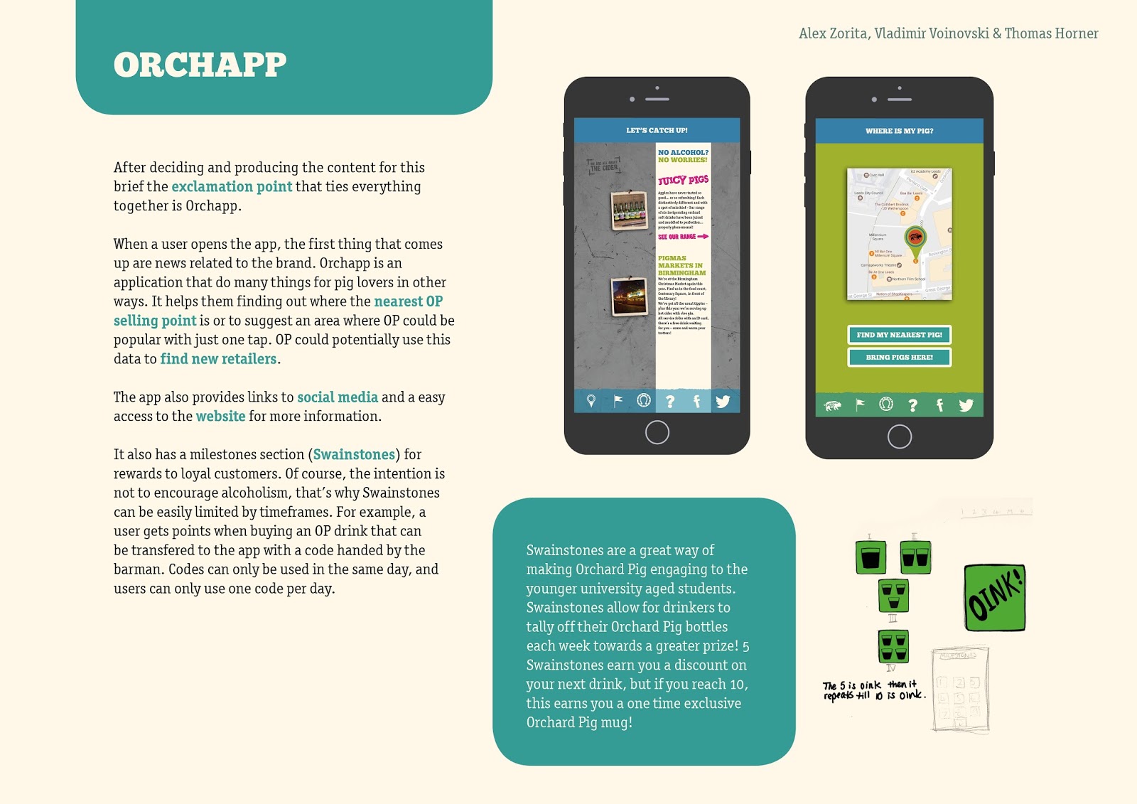
App - Vlad (Map section and sections pictograms), Tom (Milestones section) and Alex (App design  + games section) - Deadline: 17th of March


I was supposed to design the pint with the shape of a hoof, but my skills on Sketch Up are not as good as I originally thought. Luckily, I started to design it quite early, which allowed Vlad switching work with Vlad.
We were considering making an animation, but after settling the idea we thought it might be too ambitious. It will be made depending on how things are developed. Tom can do the illustration, as he has an amazing portfolio in this matter, and Vlad could potentially animate it. I can take care of the post-production adding audio and colour grading everything if necessary, as I have experience with that.

The vibe in the group is great and everyone seem with motivation to carry out the work. Tom is a bit absent during our chats online. He answers our questions of how the work is going, but doesn't seem to fully engage with the brief. It is probably because he is dealing with a part-time job, which is understandable. He only has been able to meet us in one occasion, but his work seems to be progressing as much as ours. Vlad has engaged with the project with passion and it is very easy to work with him. For some reason, I've ended up doing a bit of art direction, but the guys seemed to like my ideas and where I was suggesting to take this project to. Vlad is also very supportive developing further ideas that I come up with, which is always important. He always question my decisions and we have an excellent communication, which I think are two very important things and it makes me see how important is for him this brief. The only thing is that he is not fully interested in winning, which makes me feel like he is doing just enough to get the work done. But apart from that it's just a different approach to solving the same problem, nothing that should create problems in our collaboration.

After some time, Tom's absence persisted and I wanted to try to solve this problem. And after talking to the tutors I decided to e-mail him in order to help solving any problems he might have. This was the original e-mail and the answer:


In the meeting that followed, Tom had a lot of participation. It was good to see him enjoying and taking the work that seriously. Using one of the animation rooms and a board, we decided what needed to be designed for the app and we split the work.

Vlad (Map section and sections pictograms), Tom (Milestones section) and Alex (App design  + games section) - Deadline: 17th of March


By the 5th of March, not all the designs were finished as it was established to be able to focus on the app. Tom said he needed more time. It was the 17th of March when he updated us with his work, letting us know that he couldn't render his model due to some complications. I explained him that's exactly why I wanted to finish everything by the 5th, to also have the possibility to work on potential setbacks, but he said he was working on many different briefs at the moment. We will have to present the point of pour in the form of a sketch.

By the 17th my work was done, including the presentation boards. I didn't have most of the work to be shown but if the boards were written then the remaining days would only be about adding the work on them. I made some mistakes in the writing on purpose when I passed it to the other members of the group asking for possible corrections and opinions. This might seem like a bit sneaky strategy, but it has a good purpose. If they don't say anything, I will tell them about these mistakes so they will have to admit it and they will read them, add their bits or get rid of some of mine. It is a team submission and I want them to be part of it as much as I am.

On the 18th the deadline is very close. They know my intentions of finishing this as soon as possible to have it ready to go. Now is when we need more communication and they should be sending the final outcomes. I'm getting anxious, but I don't want to "be that guy" on them. So I'm just listing the things they need to send me on the chat and saying that I need them for today, because otherwise I'll get everything the last day and it's me who has to put everything together.


I kept insisting on them about reading the design boards, but they said they already read them. I advised them about the grammar mistakes, and after that, they admitted that they only skimmed the text. The last time I insisted was when one of them asked me why a design looked in a specific way, and I replied that it was explained in the text of the design boards. Eventually, they were submitted with at least one mistake (not done on purpose). The word mischievous wasn't correctly spelled. I should have run a spell check, but I would have liked them to read the boards anyway.

The week of the 13th was the week I was hoping to have everything finished and ready to submit. Vlad managed to finish his designs by the end of that week. The 21st of March, a week later and a day before the submission, I get this e-mail from Tom:


When I got this e-mail I was polishing the presentation boards and making sure everything was ready to go. If I had the time I would probably had finished his work off for the sake of the submission... if I knew what to do, because I wasn't sure what he meant with putting that together and I couldn't ask him, because he was working. In this situation I decided to leave it as it was. I could have done his work despite the unfairness, but that wouldn't have reflected well on this brief. It was his responsibility and I tried to warn him as it can be seen in this post. What I did do to try to keep this submission in a high standard was asking him for a paragraph to explain what he sent for the presentation boards and presented his sketches in the best way possible.

On the 22nd of March, I met with Vlad and Tom to fill the submission together. Before sending the boards I offered them the last chance to have a look to the presentation boards. It was succesfully submitted without any kind of problems.


Sunday 19 March 2017

Celebrating an event in Leeds: Idea generation

When identifying an event that had taken place in Leeds and could be celebrated, I tried to find relations between what I am interested in and what I already knew about the city. This is a list of the events considered:

- Chapeltown Riots (difficult concept to celebrate, but these events had interesting reasons)

- Looked into Celtic heritage, but there was nothing remarkable. Same as pre-historian.

- Multi-culturality of the city

- Louise Le Prince: the person who first recorded video footage. Did it first at Oakwood Grange, in Roundhay Park and secondly at Leeds Bridge in 1988. He mysteriously disappeared being the father of cinematography.

- JRR Tolkien - The author of The Lord of the Rings once lived in Leeds. There's a theory that Kevin Grady proposes where it seems that Tolkien was inpired by the Meanwood Valley when writing the LOTR. Another theory is that the two towers might be inspired in the tower of the Leeds Uni (white) and the church down the road (black).

- Another idea was to do something with Leeds Market, as it is the largest covered market in Europe.


The three ideas presented were Le Prince, Tolkien and Leeds Market, and the one with more potential seemed to be the first one.

Some of the ideas were to use more than just colours, also typefaces. Finding a way to show Leeds then, and Leeds now. This inspired the idea of shooting the bridge from the exact same spot as Le Prince did in his day. As it is a second or two of footage running in a low frame rate, the frames can be used individually for a flipbook or something similar. But since the publication is going to be exhibited, that's not the best idea. Do something related with time and the bridge.

The following examples are visual ideas that represent duality, which can be used to represent past and present, using colours, shapes and type.


Product Range Distribution: Brief interpretation + Research and Feedback

This brief was a bit confusing at the beginning. Speaking in terms of sustainability and without knowing very much about it is quite difficult to think about something else rather than environmental issues.

It became much more clearer what the brief was about after the presentation of famous pieces of work that also served as a range of ideas to be used in the brief itself. The challenge is to find a cohesion between a human issue and the aesthetics.

Something that has helped it's the fact that I own a Facebook page (in Spanish) where I like to post and reflect about social and political issues, but there is a common topic and that is feminism.

As this page is mostly used to share content on internet the research has been already done, but now it's necessary a second research, which is to identify which in what direction or what specific aspect of feminism is going to be explored with the publication.

The approaches can be very varied. These are some examples:

- 50% of humanity is being discriminated and those who dare to point it out are called feminazis.

- A woman holding a banner that says: "I know, I know. I stand up for myself. I'm such a bitch..."

- As a male and open supporter of feminism I've never been called a feminazi. I guess being a male doesn't make me evil enough.

- Please, keep attacking feminism. The quality of your arguments only makes it more necessary.

- A woman holding a banner that says: "Excuse me, we are being murdered".

- Linday Denley was an expert in martial arts. She was in the "black belt hall of fame" with Chuck Norris and Jackie Chan. She has been 16 times world champion in Taekwondo and she doesn't even have a wikipedia.

- The word 'feminazi' was popularised in the 90's by Rush Limbough, one of the strongest Trump supporters.

- There is machismo in our society. That's not an opinion. An opinion is if you think it is wrong or not.

- If a man cannot freely cry it's because this behaviour is considered feminine, and being like a woman is never good.

- Those men afraid of feminism think women want to do with them what men did with women.

- Feminism doesn't hate men. Feminism is about women. Get over it.

- Greatest f̶e̶m̶a̶l̶e̶ athlete ever. Nike.


- This was thought following the theories of logocentrism of Jacques Derrida.

Why is it called mother nature? Even in languages like in English, which this word is genderless. When we think about nature, what do we think about? We call it wise, but we don't understand it. It is definetely not something cultural. Culture makes sense to us, it represents the civilisation, the rational, the logic. If the mother is the nature in this binary thought, then the father has to be the culture.

- Dialogue.

A) Women are very hard to read

B) Actually, we just...


A) Such complex creatures...

B) If you just liste...

A) So mysterious!


- Women shouldn't have to be brave. They should be able to decide if they want to be brave.


Other issues not related with feminism:

- In Germany it is a crime to make apology to fascism. In Spain it is a crime to make fun of it

- "If a white man wants to lynch me, that's his problem. If he's got the power to lynch me, that's my problem. Racism is not a question of attitude, it's a question of power".

- Heterosexual white men are victims of never been oppressed, they have only been oppressors. Please, be more considerate.

- List of rights earned through moderation and being politically correct. (Blank page).

- Brexit didn't cause racism or hate. It was already there and it was spoken when the opportunity was right.

- "In 20 years a movie called 'Aleppo' will win 7 oscars and everyone will say something like that should never be allowed to happen again" @ayeshamirza_

There are many different approaches to make one single point. As it is a piece of graphic design what is going to be produced, it is a good idea to isolate those ideas that can be more visually striking. They have been highlighted in different shades of yellow to identify the strongest ones but not to neglect others with potential.

These ideas were explained to Simon in order to get Feedback about how to reach further with the research. He helped to identify the purpose of this campaign, which would be educational - raising awareness about importance of feminism - . It is also important to avoid a angry approach, it's important to keep the message possitive. What can also help to expand the research is to identify the potential target audience of this design.

Taking the chance that the 8th of March was the international women's day I attended to an exhibition that took place in the Art Hostel, at Leeds City Centre, where the Fanny Collective was running the exhibition "Pretty", which was a celebration of the female body as it is. As a male designer myself I don't think doing something along this lines will convey the same message as if it created by a female designer, which is very interesting as it shows how important it is the relation between the creative and the piece he or she is creating. Although, this visit has lit some bulbs, as it is celebrating the parts of the femininity that normally have negative connotations like the period, the hair, etc.


The focus on this project will be on pointing out that male related sport achievements are considered neutral whilst female's are considered lower ranged. For instance, one needs to specifically refer to women's football to give a context of what is going to be explained, but men's football needs no context. In all these sports there's an assumption that just because males are, in general, more physically capable male's sports are then more interesting, as the athletes meet higher expectations. In basketball, for instance, it's true that the male's basketball is more physical, but no one is aware that female's basketball is more technical and strategic.

The message has to be conveyed in a positive way. The "Pretty" exhibition turned around what is usually understood as a negative or hidden side of women and made something positive out of it, showing that things like hair, menstruation, etc are part of women's identity. Using this approach the female sports can be represented as interesting as male sports by not denying that women might be less physical, but by admitting women's sports might be better in some aspects.

In this article by layups.com they explain why female's basketball is different:

"The team mechanics and styles are also very different. Men will always attempt to plow through things with athleticism and skill while women tend to analyze a situation and come up with a response. Women’s basketball tends to be slightly more technical, and the women’s learning styles are far more different and vocal. Men will ask a question, and answer a question. Nice and simple. Women will ask a question, answer the question, and analyze it. Coming ups with in-depth and correct answers that not only help the coaches but also help the players."

After reading this, there's a statement that can be made: if a woman is better than a man in, for example, basketball she will never have the opportunity to beat him or to play a specific role in a team. Same could be applicable to Linda Denley: would she be famous if she had the opportunity to defeat a man? In other words: should sports be gender mixed for a more equal society?

The Science of the Sport website has an article about this issue written by Ross Tucker. This quote from the book "Genetic, technology and sport" is further discussed:

“We have argued that it (gender categories in sport) should be abolished. Women and men should compete against one another on equal terms on sports arenas. The reasons for giving up sexual discrimination within sports, and for allowing individuals of both sexes to compete with each other is simple. In sports it is crucial that the best person wins. The sexual differences are simply irrelevant. If a female athlete can perform better than a male athlete, this female athlete should be allowed to compete with, and beat, the male athlete. If she cannot beat a certain male athlete, so be it. If the competition was fair, she should be able to face the fact that he was more talented. It is really as simple as that. Sexual discrimination within sports does not have any better rationale than sexual discrimination in any other fields of our lives”.


TAMBURRIN AND TANNSJO, GENETIC TECHNOLOGY AND SPORT

On a counter-point this should be also taken in consideration: "no female athlete makes the top 500 of any athletic, swimming event each year, and so the chance that “a female athlete will perform better than a male athlete” at the top level of competition (Olympic Games) is basically zero".

Mixing genders would probably result in a much more competitive scene, and many argue that keeping both sports separated is positive for gender equality. But then one of the main principles of sports is neglected: "may the best win". If it's true that males are always better in sports then the right thing to do would be keeping female sports to safeguard the proliferation of female athletes, but at the same time male sports should be actually neutral and accept women that can perform better than them.

In this article of the BBC are mentioned several sports that could be gender mixed. Some examples are Golf, Gymnastics, Bobsleigh, Cycling... While in this other article it's pointed out 3 sports where males and females are mixed: Moto 3, Badminton and Ironman decathlon. This article adds two more to this small list: equestrian and sailing.


An interesting survey shows the vote of different people in a website of debates where the 67% thinks that sports should be mixed whilst 33% thinks they shouldn't.

This article makes strong points of why sports should be gender mixed by analysing two very deep analysis of the topic.

In opposition: On the other hand, in sports with a more technical emphasis (although all still physical, perhaps less so than the brute force sports like those listed above) such as badminton, hockey, golf, tennis, netball and others where physical differences between individual players are not so obviously influential on the result of a match can be made up for in technical ability, mixed teams are far more feasible and are definitely to be encouraged.

In favour: "Consider these examples. Athletic Bilbao, a football team that only recruits players with connections to the Basque region, isn’t operating unfairly. Stonewall FC, a team that calls itself a “gay football club” and aims to recruit homosexual players, isn’t doing anything wrong. These teams offer ‘two bites at the cherry’ to certain people, but that’s okay. Sustaining a dedicated sporting platform for a portion of society that struggles for representation amongst mainstream sport, and wishes to assert an identity that our society endorses, is completely acceptable. Likewise, even if we abolished male-only sports, women would be – for as long as they struggle for sporting representation – entitled to a dedicated sporting platform. That’s one of the roles of female-only sports, and that’s why it wouldn’t be unfair if we let them continue. There’s no reason whatsoever to wait around over this. Male-only sports are arbitrary and unjust, and we should start getting rid of them today."

But in the end, this seems to be a debate that still goes on. To see what people would normally think about this issue I made a questionnaire with only one question. From left to right, the answers are from strongly disagree to strongly agree.

Friday 10 March 2017

Appropriation task

A story of fake beggars on the mass media have an impact on people in real need.

It's not a good excercise of responsibility to publish stuff like this, because it affects people's opinions and persepctives.

It's sold as fake (used individual letters for a criminal look  the mass media is the real criminals -and also to make it different from the rest of the text).

The monkey is the audience (sorry, monkeys).

The big guy observing represents the mass media as a whole, observing like it is a experiment, looking how the monkey reacts. He is over a black background, in the shadows.

'20p cheaper than the sun' shows how miserable media is, negotiating pences in exchange of the same crappy content. If I don't want to spend more money because I don't mind about the quality of information I read, I'll get the Metro, which is as bad.

In the end they don't care about the damage they produce. They are only there for the money.

Sunday 5 March 2017

Orchard Pig: Production and Feedback

To produce the 6 pack box Vlad, one of the animators, created a 3D model of the box on Maya and passed me the UV maps.

To identify what needed to be designed, each face was numbered and sent back to Vlad to get screenshots of the actual 3D model.


With this information it was necessary to create a template for the designs to be placed once finished and make everything really easy to modify if needed. The UV map wasn't even. It was asymmetrical, and that made me discuss with Vlad if it wasn't a better idea to use a mock-up from internet, as we just wanted to show the concept and the mock-up wasn't that important. But the character he designed was already put on a side, and it would happen the same with the box. So I proposed a solution: changing the box for a more unique design, so his modelling would be totally justified. So to make it more country-ish I got inspired by the bucket they have on the website. By adding ropes to the box it wouldn't increase the cost a lot and the experience of buying/carrying the cider would be much more appropriate with the whole brand.

In the UV map the numbers from 19 to 24 were removed to add the ropes, so only the faces with numbers from 1 to 10 needed to be designed.


When designing the box, the first drafts were tossed away as it was quickly identified that 3 different boxes needed to be done for the 3 different bottled flavours: Reveller, Charmer and Truffler. The logotypes for each flavour had to be vectorised, as the versions found on internet were low-res. It made sense then to use the ripped paper look they use in many different parts of their brand as well as the colour scheme they have chosen for their products.

The images used for the packaging are public domain, but they were only to be used for the design process. If needed, pictures of wood could be taken once the design was finished.


The design of the boxes then changed to something that fits better into their general look. I used a public domain wooden surface to give the boxes a more country feel to them. The big sizes show the brand and the flavour without anything to distract the viewer. On the sides, there's more information about other bottled and draught drinks using the elements and style from their website. The bottom of the box can be used for the bar code and there is a little section right below the bottle to include any legal information.

The bottles have a parallel shadow to stand out more from the background, as it is quite realistic. The titles are not blended with the wood to stand out more and they have a shadow on it to make it look that it is floating. The information about the drinks is also from their website. Once the design of the point of pour is finished it will be changed for the handle they have already designed. Their website is also displayed.

The pig footprints are a clue for the viewer to follow and get more information about Orchard Pig. The "Oink!" indicates the end of the track, the goal of the pig, the section with more information about these ciders. So one big side is connected with one of the small ones by the prints and the line that goes across the design.


The different parts of the submission were thought to work better united by something else and that work as an extension of the brand. An App would potentially serve these purposes to provide the users information about where the product is sold, interaction with real fans and treat them as they deserve it. The pint, for instance, doesn't have to be limited to the pub and fans could potentially win them for being loyal. We, as a group, agreed to undertake the work for different sections of the app and I would be the one putting everything together in the end, since I am the graphic designer.

Right before this part started, we had a feedback session. During that session, we explained our entire concept and ideas so we could ask in the end: 'do you think the creation of an app is justified?'. We also wanted to include games in that app, but not to isolate individuals with their phones. All the opposite: to ensure a good time between friends and use the phone as a mere tool. More or less like Nintendo is doing with 1,2 Switch, where players can have fun together only using the screen as a reference, but when they play looking at each other. This session helped us to know that everything we were doing seemed to make sense to others and even liked by some. We also got a bunch of suggestions for making games, like pulling straws, mind swipping, etc.


The loading screen was copied from the website to keep the consistency as it has been done with the rest of the designs. The typefaces have been the only thing that has been difficult to match, but there are free alternatives available online that have helped the design to take shape.


The main menu of the app shows the last news and information about events that OP fans might find interesting, again, keeping not only the design style but the tone of voice on the banners at the top of each section. There are direct links to social media profiles. These icons were vectorised from the ones in the website. The other icons were designed by Vlad trying to keep them recognisible and minimal, except for the "games" section, where we wanted to do something that stood out with a country-ish feel.


One of the sections it was considered important for the company and the users was to provide a way to not only find where OP is sold, but also to suggest the company a potential client. That is data they can use to expand their businesses or know the areas where they are most popular to consider events. This section was designed by Vlad.


The swainstones couldn't been digitally finished, but they were submitted in the format of sketches.

After deciding and producing the content for this brief the exclamation point that ties everything together is Orchapp. When a user opens the app, the first thing that comes up are news related to the brand. Orchapp is an application that do many things for pig lovers in other ways. It helps them finding out where the nearest OP selling point is or to suggest an area where OP could be popular with just one tap. OP could potentially use this data to find new retailers. The app also provides links to social media and a easy access to the website for more information. It also has a milestones section (Swainstones) for rewards to loyal customers. Of course, the intention is not to encourage alcoholism, that’s why Swainstones can be easily limited by timeframes. For example, a user gets points when buying an OP drink that can be transfered to the app with a code handed by the barman. Codes can only be used in the same day, and users can only use one code per day. Swainstones are a great way of making Orchard Pig engaging to the younger university aged students. Swainstones allow for drinkers to tally off their Orchard Pig bottles each week towards a greater prize. 5 Swainstones earn users a discount on next drinks, and when they reach 10, this earns an Orchard Pig mug.

This section was designed by Tom.


The Orchapp is also a great opportunity to make people enjoy even more their time having a drink, regardless of what drink.

The app contains a games section. These games are not designed to make people stare to the screen of the phone. They are simple games to make people have a good laugh and interact between them. There are three games:

1) Pig it down!

Players put a finger on an empty screen. After a few seconds, the pigs appear. Whoever is touching the pigs, win. The losers pay for the next round.

2) Truth or dare

Old classic with the addition of a roulette to make conversations have a fun turn.

3) Story time

Another roulette game. Whoever is pointed out, gets 3 random items. These items create a story that needs to be created in 10 seconds. This final section was designed by me.


Of course, these are just a few interpretations of what can be done with the app, but the possibilities are endless: redeeming codes for scanning a point of pour, or codes that come with Orchard Pig boxes, etc.