This module might appear in principle like any other, but there are a few elements that make it quite different from the others.
With Studio Brief 1 having to research an event that took place in Leeds limits the scope much more from what we are used to. It was hard to find an event I felt convinced by, but the truth is that commercial briefs can be very much like this one, where it's necessary to praise a place/event one doesn't feel completely related to. But going to the bridge and researching about it has taught me some history that I would have never known on my own.
I could say this kind of brief has taught me not only new design skills, like victorian ornamentation and screen-printing something with most of the screen revealed, but also cultural knowledge about a specific event and this is always very welcome.
This learning process was something I wanted to illustrate in the final print so the people in the exhibition don't just pass by, but maybe stop and appreciate the details that make it not only another victorian illustration, but one with a story behind with witty references. Also, the final outcome could have been improved by subjecting the print to a fake aging process to enhance what was intended.
In Studio Brief 2 the approach and development was quite different. The first part of the brief focused on research, which I think was vital to pin down what needed to be done. When working with ethical and social issues a designer can easily find stones in the way that are difficult to deal with as, eventually, the work is going to be more subject to judgement, misinterpretation or critique as in opposition to a commercial brief. It is designers job to find workarounds to make sure the message that is intended to be sent is appropriately understood. This is particularly challenging with positive messages, as it's easier to point out what is wrong instead of encouraging others and oneself how to face these problems, as it's not very nice to tell people how to deal with certain stuff. That's where the challenge is in a brief like this.
The outcomes of this project wouldn't have been possible without using content created by third parties. New photographies or illustrations that don't copy a photography would be needed in order to make this brief 'in the real world'. Although, it was very interesting and reinforced the point of this project was the fact that the images on internet that can be found of these famous female athletes are very limited in terms of quality and variety. This made very hard to find information about the photographers to contact them for permission.
The technique that is proposed to be used to lay those illustrations on the walls requires time and high doses of patience. Using small stencils might produce a displacement that can be very noticeable with words being split. Also, despite the work wasn't physically produced, I wanted to make sure it was doable. After speaking to the staff at LCA, I realised that the illustrations would need to be re-done as the letters would need to be modified in order to place them on a stencil. For instance, the counter in the 'O' needs to be linked with the exterior of the letter so it stays there when the paper is cut. This was a valuable lesson for future ideas.
On feedback sessions a common suggestion was to make this somehow work in social media. A very good idea would be to release an app or add a feature to an existing one that could make an illustration out of a photography with a chosen word. This could be done by giving simple instructions like, for instance, making sure that the picture taken has a white background. To ease the process of making the app and to avoid a misuse of it, the words might be limited and offered to the user as a choice. The promotion of this app could be done as a footnote of the illustrations or through the celebrities. This would encourage people from everywhere to make their own picture with a similar technique and share it on social media. This could work as an addition to the main purpose, but I didn't want to make it the main purpose of this project as what was important from the beginning of the production was the normalisation of female athletes figures in common environments for young generations.
Tuesday 16 May 2017
Monday 15 May 2017
Product Range Distribution: Production + Feedback
Based on all the feedback got in the studio and from the educator, the best idea seemed to create something bold that gave visibility to female athletes with clear and strong messages taking in consideration the space where they are going to be shown and providing interactivity.
The idea that was going to be developed was making illustrations of existing photographs of female athletes out of words that are related to them and encourage younger generations to use as references.
These are some examples:
Male cheerleader (holding up something, like a ceiling)
Female basketball player dunking in some high edge (Brittney Griner) Her look can appeal to younger audiences. She is also into feminism and equality


Female boxer (Amaiya Zafar next to the school bell. waves from the bell to her)

Male Figure skating (lines across the floor with Javier Fernandez jumping pasted on a wall)


Some inspirational images designed by others:


After a while, I thought that the best idea was probably to use only women to stick to the main purpose of the research. Also, using the technique of stenciled words with the athlete in action results in not showing the face properly.
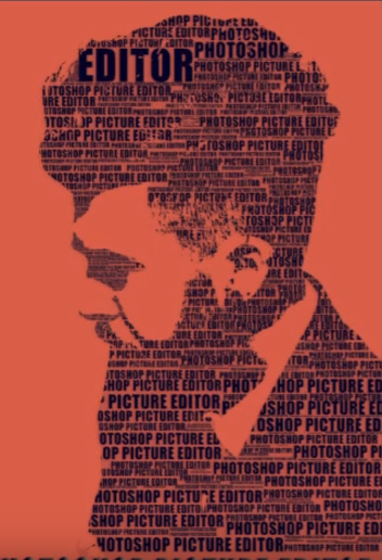
There are different techniques for this. Some research and testings was needed to find out which one was the most appropriate


As it can be seen in this test, if the picture is not a close up the details in the face are lost, which makes a famous female athlete look like any other. To make this effect the chosen font is Bebas, as it has connotations of passion and sport.

All these tutorials used Photoshop for their techniques. I tried to find a way to make it on illustrator as the size is going to be quite big, but most of these designs rely on the use of layer masks. So I tried to work on the biggest size I possibly could, which eventually was 75x75 cm and making sure the smallest text didn't pixelate. Although, this designs can be used later on in Illustrator to recreate them in vectors, but tracing it is not a possible avenue, as it distorts the text.
I produced 2 different illustrations to take them to the crits. I also played around with colours and layouts to add the name. The colours for Brittney Griner are the ones of the team she plays in (Phoenix Mercury). For Amaiya Zafar, the boxer, colours like white, black and red are very representative of boxing.


For Brittney Griner I used the word strenght not only because she is a very physical and strong player, but also because of one of her famous quotes:
"I am a strong, black, lesbian woman. Every time I say it, I feel so much better".
The word "Strength" is bigger at her fist: she shows proud for her strength but also holds it as she is in control of it.
In regards to Amaiya, the word faith represents both her attitude towards boxing, believing in herself and also believing that she can change the regulation towards clothes, as this olympic discipline haven't considered that a woman with a hijab can also be a boxer. She's a game changer and she deserves to be praised for it. The word faith it's bigger at her chest, as it's close to her heart, and her arms since she is a boxer.
The main idea to produce this was to divide the illustration in A4 papers to stencil them out, organising them and then spraying paint on a wall. The interaction came when the kids playing would be encouraged to tear the papers off, revealing the image and keeping the positive words as a message. But this lacks of purpose and it's probably not entirely feasible considering the size these illustrations are going to be.
As it was pointed out in previous feedback sessions and in the final one, the best way to encourage interactivity is maybe by using social media. A very good idea would be to release an app or add a feature to an existing one that could make an illustration out of a photography with a chosen word. This could be done by giving simple instructions like, for instance, making sure that the picture taken has a white background. To ease the process of making the app and to avoid a misuse of it, the words might be limited and offered to the user as a choice. Also, I was concerned about not producing any physical work, but Simon Jones said that mock ups were fine.
The typeface of the name was changed to something that looked handwritten as it gives a more personal touch, like if that person was there once which, in a way, they were.
Before adding any text, the illustrations are imported to InDesign to apply a grid and put the text in its place.


Mock ups:


The number of illustrations made for this purpose can be very high. But to clearly show what is intended with this project one more illustration is needed. This is to provide enough evidence where a pattern can be perceived.
I decided to use Serena Williams because she is a very inspirational female athlete and a reference to many other athletes. Tennis balls colours is what informs the colour of the text and purple for Serena, as it is a symbol of feminism as well as the complementary colour of lime green.


The idea that was going to be developed was making illustrations of existing photographs of female athletes out of words that are related to them and encourage younger generations to use as references.
These are some examples:
Male cheerleader (holding up something, like a ceiling)
Female basketball player dunking in some high edge (Brittney Griner) Her look can appeal to younger audiences. She is also into feminism and equality


Female boxer (Amaiya Zafar next to the school bell. waves from the bell to her)

Male Figure skating (lines across the floor with Javier Fernandez jumping pasted on a wall)


Some inspirational images designed by others:


After a while, I thought that the best idea was probably to use only women to stick to the main purpose of the research. Also, using the technique of stenciled words with the athlete in action results in not showing the face properly.
There are different techniques for this. Some research and testings was needed to find out which one was the most appropriate


As it can be seen in this test, if the picture is not a close up the details in the face are lost, which makes a famous female athlete look like any other. To make this effect the chosen font is Bebas, as it has connotations of passion and sport.

All these tutorials used Photoshop for their techniques. I tried to find a way to make it on illustrator as the size is going to be quite big, but most of these designs rely on the use of layer masks. So I tried to work on the biggest size I possibly could, which eventually was 75x75 cm and making sure the smallest text didn't pixelate. Although, this designs can be used later on in Illustrator to recreate them in vectors, but tracing it is not a possible avenue, as it distorts the text.
I produced 2 different illustrations to take them to the crits. I also played around with colours and layouts to add the name. The colours for Brittney Griner are the ones of the team she plays in (Phoenix Mercury). For Amaiya Zafar, the boxer, colours like white, black and red are very representative of boxing.


For Brittney Griner I used the word strenght not only because she is a very physical and strong player, but also because of one of her famous quotes:
"I am a strong, black, lesbian woman. Every time I say it, I feel so much better".
The word "Strength" is bigger at her fist: she shows proud for her strength but also holds it as she is in control of it.
In regards to Amaiya, the word faith represents both her attitude towards boxing, believing in herself and also believing that she can change the regulation towards clothes, as this olympic discipline haven't considered that a woman with a hijab can also be a boxer. She's a game changer and she deserves to be praised for it. The word faith it's bigger at her chest, as it's close to her heart, and her arms since she is a boxer.
The main idea to produce this was to divide the illustration in A4 papers to stencil them out, organising them and then spraying paint on a wall. The interaction came when the kids playing would be encouraged to tear the papers off, revealing the image and keeping the positive words as a message. But this lacks of purpose and it's probably not entirely feasible considering the size these illustrations are going to be.
As it was pointed out in previous feedback sessions and in the final one, the best way to encourage interactivity is maybe by using social media. A very good idea would be to release an app or add a feature to an existing one that could make an illustration out of a photography with a chosen word. This could be done by giving simple instructions like, for instance, making sure that the picture taken has a white background. To ease the process of making the app and to avoid a misuse of it, the words might be limited and offered to the user as a choice. Also, I was concerned about not producing any physical work, but Simon Jones said that mock ups were fine.
The typeface of the name was changed to something that looked handwritten as it gives a more personal touch, like if that person was there once which, in a way, they were.
Before adding any text, the illustrations are imported to InDesign to apply a grid and put the text in its place.


Mock ups:


The number of illustrations made for this purpose can be very high. But to clearly show what is intended with this project one more illustration is needed. This is to provide enough evidence where a pattern can be perceived.
I decided to use Serena Williams because she is a very inspirational female athlete and a reference to many other athletes. Tennis balls colours is what informs the colour of the text and purple for Serena, as it is a symbol of feminism as well as the complementary colour of lime green.


Sunday 14 May 2017
Product Range Distribution: The Brief
Problem
Despite this is something that is slowly changing, female athletes don't usually have the coverage on media as male athletes do. This has a direct repercussion of how we understand and categorise people based on their genders. It's often assumed that female sports don't have the same coverage or presence as the "neutral" sports because they are softer or not as dedicated.
Objectives/Aims
Break the stereotypes and normalise the figure of female athletes putting them in such position that can be admired without relying on mass media.
Target Audience
Younger generations between 10 - 15
|
Deliverables
The outcome/s should work in a range of media that appeals to this audience
|
Supporting Resources/Information
Saturday 13 May 2017
Product Range Distribution: Primary research with educator
When thinking for ideas for this project, I remembered that a friend of mine is an educator. This was a very good opportunity to find out how my ideas could work in the best possible way.
When speaking to this educator, she made a couple of points I found very useful:
- You have to make sure you break the standards of gender classification instead of merely making the female athletes more visible.
- This idea could work better with kids, since they are being educated and not re-educated. So over-making visible female athletes is a bit out of context. As they are being educated to avoid that.
- Use simple phrases, positive words.
This feedback was key to identify exactly what to produce, which is the images of female athletes (visibility) made out of positive words that define them.
Product Range Distribution: Idea generation + Feedback
The target audience of this project would be mainly young students between the ages of 10 and 15 as the intention is to normalise the fact that a woman athlete can be as good as a male athlete and this can only be done from a very young age.
The first ideas were around making a school campaign about playing together and sharing.
1) An activity to make students see they are all equal. The purpose of this activity would be learning from one another. For instance, make a boy who doesn't know about ballet see how hard this discipline is. They would have to learn as much as they can from each others interests.
This is based on some quotes I've found related to the stereotypes surrounding female athletes.
"I don't like that man. I must get to know him better". Abraham Lincoln. This teaches the lesson that you can't dislike something you don't know about, which is normally the case.
Young students would get in mixed pairs and they'll have one hour to learn from others passions/interests. At the end, everyone gets a note with a positive message of what they are doing: E.G: I think John is very strong for swimming in competitions.
It could have the structure of a game:
- Draw yourself doing your favourite activity.
- Get in pairs.
- Write a small piece of text saying what you admire of that person (this is of course checked by teachers to avoid trolling).
- Prize: Everyone gets to read something nice about them, making them feel more confident and encouraging others to appreciate other people's work.
2) Series of posters for schools of women playing sports to normalise it. Posters of the most famous female athletes to counter-weight mass media with positive messages: Strenght, happiness, dedication. (Words related to them).
Use women as reference for children.
At some point, they'll wonder why they were women. Maybe show males practising a female-dominated sport.
3) Use school furniture for messages. Use the back of a chair to print on an athlete name, messages of how awesome is to be oneself, sports, records set by women, quotes from female athletes...
The problem with this is that the general message can be misunderstood as "women have to achieve something to be heard". The truth is that it happens the same with men, but mass media have them covered.
- Use names of female athletes that have proven being better than men.
This isn't to say women are better than men, but to prove that men are not necessarily physically superior despite what we normally assume. Men might be stronger, faster, etc. But in a professional sport many different features take place.
It's not about competition or who's the best, but about understanding what we are really capable of despite what we are told. Just do it.
Feedback
After having a discussion with the educator and after having this ideas, I had a chat with Simon Jones as the design was most likely to be a poster. This could be a flexible and functional response to the brief, but in terms of creativity there are probably other responses that will engage more with the audience.


In the feedback session where we had to walk around the studio to leave feedback, I left this document on the screen and a piece of paper for the answers. The answers can be found in the submission folder or down below.


This feedback was very useful and gave me some ideas to carry on with the work. Some of the comments suggested to encourage people to interact with the illustrations and place them in uncommon places, like a sports hall. Also, finding a way to link this to social media could better aim to the target audience in mind.
The first ideas were around making a school campaign about playing together and sharing.
1) An activity to make students see they are all equal. The purpose of this activity would be learning from one another. For instance, make a boy who doesn't know about ballet see how hard this discipline is. They would have to learn as much as they can from each others interests.
This is based on some quotes I've found related to the stereotypes surrounding female athletes.
"I don't like that man. I must get to know him better". Abraham Lincoln. This teaches the lesson that you can't dislike something you don't know about, which is normally the case.
Young students would get in mixed pairs and they'll have one hour to learn from others passions/interests. At the end, everyone gets a note with a positive message of what they are doing: E.G: I think John is very strong for swimming in competitions.
It could have the structure of a game:
- Draw yourself doing your favourite activity.
- Get in pairs.
- Write a small piece of text saying what you admire of that person (this is of course checked by teachers to avoid trolling).
- Prize: Everyone gets to read something nice about them, making them feel more confident and encouraging others to appreciate other people's work.
2) Series of posters for schools of women playing sports to normalise it. Posters of the most famous female athletes to counter-weight mass media with positive messages: Strenght, happiness, dedication. (Words related to them).
Use women as reference for children.
At some point, they'll wonder why they were women. Maybe show males practising a female-dominated sport.
3) Use school furniture for messages. Use the back of a chair to print on an athlete name, messages of how awesome is to be oneself, sports, records set by women, quotes from female athletes...
The problem with this is that the general message can be misunderstood as "women have to achieve something to be heard". The truth is that it happens the same with men, but mass media have them covered.
- Use names of female athletes that have proven being better than men.
This isn't to say women are better than men, but to prove that men are not necessarily physically superior despite what we normally assume. Men might be stronger, faster, etc. But in a professional sport many different features take place.
It's not about competition or who's the best, but about understanding what we are really capable of despite what we are told. Just do it.
Feedback
After having a discussion with the educator and after having this ideas, I had a chat with Simon Jones as the design was most likely to be a poster. This could be a flexible and functional response to the brief, but in terms of creativity there are probably other responses that will engage more with the audience.

In the feedback session where we had to walk around the studio to leave feedback, I left this document on the screen and a piece of paper for the answers. The answers can be found in the submission folder or down below.


This feedback was very useful and gave me some ideas to carry on with the work. Some of the comments suggested to encourage people to interact with the illustrations and place them in uncommon places, like a sports hall. Also, finding a way to link this to social media could better aim to the target audience in mind.
Product Range Distribution: Pre-Idea generation + Feedback
This was a series of ideas that were written down before knowing what to do. This was a way to organise thoughts and see the possibilities the concept of males and females being separated in sports could work. Some of these are quotes from different texts and some are own ideas.
- Stencil to mark sport items with a symbol of unity.
- "Better is better - no matter what gender"
- "This is not what sports are about" (with an image of a sexualised female sport uniform)
- "Women can be better than men, let's stop being surprised by that".
- "How many times does a woman need to stand out to convince ourselves that they are as good as men?
- "Don't assume women are physically weaker than men".
- "One day a woman will be a football idol"
- "There is no way to know if a woman can beat Messi"
- A picture of messi with a title saying "this is the best male football player. (Treat male athletes as females)
- Why WNBA and not MNBA? Same with Rugby League and Premier League.
- W = Double u. Double you. Confrontational approach to the idea that women can be better than men in any sport if they were allowed to challenge men.
- WNBA is also NBA.
- Debate about separation helping equality. This is a complex issue.
- Make a questionnaire to find out what others think. As the post about research shows, there's a divided opinion. Maybe do something for a particular sport and find a way to open the door to a new possibility instead of something that confrontational. Encourage the debate.
The problem with these ideas is that they don't convey a positive message and they are confrontational for something that has yet to be more discussed. There needs to be the spirit of unification, not confrontation. Something like a peace sign.
After having a tutorial with Simon Jones, he suggested that probably the most viable way to make this idea spread is through a younger audience. Maybe Encourage schools to mix genders in their sports.


Product Range Distribution: Presentation + Feedback
To make my point from the beginning I decided to start my presentation asking if anyone knew who Linda Denley was, since she is one of the greatest martial artists in history. She is in the Hall of fame with Chuck Norris, Jackie Chan and has appeared in a bunch of movies.


After the presentation the feedback consisted mainly in focusing in specifics, not on resolutions yet. Also, something that could make a stronger point is using more examples of other unknown women. But over all, get into specifics: Is it about how the media portrays women in specific ways? It's important to make a point and back it up. But it's important to gather more empirical data, facts. For instance, is the FIFA ran by males? Also, someone mentioned that mass media is doing a better coverage of women's sports nowadays. The work should maybe focus on a specific sport or celebrity.
Subscribe to:
Posts (Atom)