


Since the poster was going to heavily rely on typographic work, there were several considerations about typefaces. First, the most basic typefaces needed to be explore to find the right tone of voice and from there it is a matter of defining it in more detail.


Helvetica - Reflection of modernity, open to interpretation in such a place full of different types of creative. It's a homage to Massimo Vignelli, a very important figure for graphic designers.
FF Meta - Young, yet experienced and confident.
Avenir - Nostalgious in a sad way
Univers - Corporate
Caslon - Nostalgious, romantic, academic
Clarendon - Café, experienced, kind
Rockwell - Successful designer sparing some time to university students to say something that helped her
Memphis - Typewriter, press, formal but excentric
It was found that Caslon was the most appropriate typeface to represent the quote for its connotations and tone. Other fonts similar to Caslon were tested, like Calluna (creative, smiling, welcoming), Leitura (sophisticated, sense of highness), Droid (firm handshake) or Cardea (Organic and artificial, like scraps of paper). From this second group, Calluna was the most appropriate, but it was too playful for the quote, so Caslon was the chosen one.
Microtypographically speaking, the text was adjusted in many different ways so the lines didn't form geometrical shapes to make it look more alive and less distracting. Also, it was a good opportunity to experiment which words needed to be highlighted and balance those highlighted words with the composition. The kerning was also manually adjusted.
The experimentaton with colours also pointed out that white and yellow could inhabit in the same space as long as they weren't the background for each other. In other words, yellow text on white background and viceversa is very difficult to read. Using a white or yellow background limits the other colours that can be chosen for the text.
A black background not only solves this problem, but it is more appropriate for the quote, as it makes it more private. Text can be shown in yellow and white can be used to highlight the important parts. This way the words can be quickly read.


The small text at the top and bottom was eventually fixed to bring a more consolidated structure to the poster. The text is:
Top: Leeds Arts University
Bottom: Leanne Taylor, 2001. Designed by Alex Zorita. alexzorita.com. In collaboration with Peter and Paul.
The following images show the evolution of the design.


The design received feedback from other designers from the Discord community Designers Creed before submitting the first draft to Peter and Paul.
They pointed out that the way the quote was breaking up needed to be fixed, and one member of the community that is a poet helped me with this bit. The problem was that the priority was ont he shape of the paragraphs instead of phrasing it with rythim.
They suggested to change the typeface for something that made it more of a strong statement, but I disagreed with this point as it is not a strong statement and the justification behind choosing Caslon seemed stronger than their arguments.
When asked if the design should have something else to represent what it's been said I was encouraged to keep the design only with text.


The design at this point was submitted to Peter and Paul in order to get feedback. This is what they received:


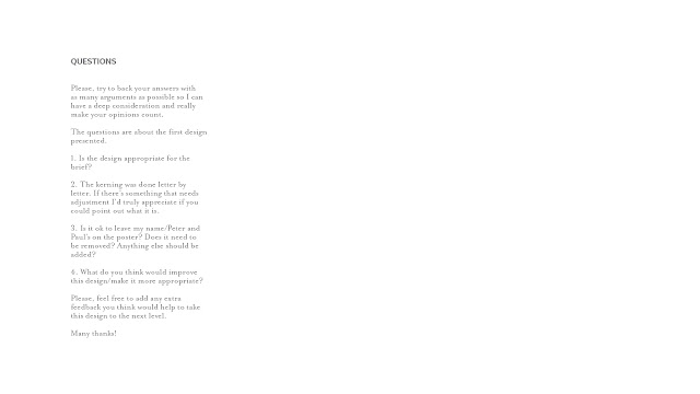
The questions I had for them were very specific, as Peter and Paul must be very busy giving feedback to the other 47 designs. The purpose was to make it easy and quickly for them.
Their feedback said:


After some more back and forth they also pointed out that the text of the credits should be removed for reasons behind the composition. They also wanted to reduce the leading and stick to Helvetica. For that, the grid was created again to match the font size and have a correct leading in relation to the aspect ratio. This is the final design they approved.


Their feedback said:
We actually prefer the top left option on the 'other designs' you supplied and we'd like to see this route developed.
One way you could do this would be to introduce a photographic element - this could be adding in an image or photographing the type itself. We would like to see a few options of this.
With regards to the names, these don't need to be included on the poster as there will be credits elsewhere.
Printing or making the type wasn't a realistic way to approach this due to time limitations (The feedback was received a week before the final deadline). Since a personal practice is the analogue photography, a good idea could be to use one of these photographies. The noise from analogue film and black and white can relate not only to the photographic practice but also to the past.
The design went through different typographic and photographic experimentation. As the text has to split (so it takes the reader back just like the quote says), it must be readable keeping the balance of the composition. It feels more natural to leave the letters randomly cut instead of making the margin cut straight through a space between words or letters. The text being off is also a direct relation to film photography that comes out off.
The photography that was eventually chosen was the one with the horizon, as it is something that's looked at for contemplation and remembrance. Left the grainy noise and the marks from the film to make the viewer aware of the presence of the photography. The horizon in black and white also helps to structure the text. Next to the name of the author of the quote, there's the location of the photography and the year it was taken, a common practice with analogue photography.
The photography that was eventually chosen was the one with the horizon, as it is something that's looked at for contemplation and remembrance. Left the grainy noise and the marks from the film to make the viewer aware of the presence of the photography. The horizon in black and white also helps to structure the text. Next to the name of the author of the quote, there's the location of the photography and the year it was taken, a common practice with analogue photography.


This was the final piece initially submitted.

The second round of Feedback from Peter and Paul pointed out that this direction was better than the first one, but they wanted to see the text in sans-serif. For that, the project was resubmitted and this time with the previous submission plus 2 other alternatives in sans-serif. These typefaces were chosen based on the previous experimentation with Avenir and Helvetica. The first poster is in Helvetica (connotations previously explained) and the second one is in Le Havre, which had a feel of being handwritten (despite not being a script typography) and more personal. The text was adjusted so the edges of the poster cut through the middle of a space or a letter. It's not exact, but the purpose is that it doesn't cut leaving a small piece out to make it look that it's done on purpose and nothing is left to randomness.


No comments:
Post a Comment